Sometimes you’ll want to join more than one map, chart or other visual together — but if you’re not a developer it can be a little tricky.
This is where the iframe scaffolder by Paris-based developer from Journalism++ Pierre Romera comes in. I made this map — used by Mother Jones — using the tool, which made it simple to join together three maps about the refugee crisis spreading across Europe.

Hosted on Github, the tool is pretty easy to use, with just a few steps between having a bunch of disparate visuals and combining them together into one comprehensive interactive guide. You just:
- Add the links you want to insert
- Arrange the iframes how you want (they can go side by side or even on a grid so you can create some cool small multiples) and add a colour theme
- The iframes can autoplay between them and each frame can be shared individually
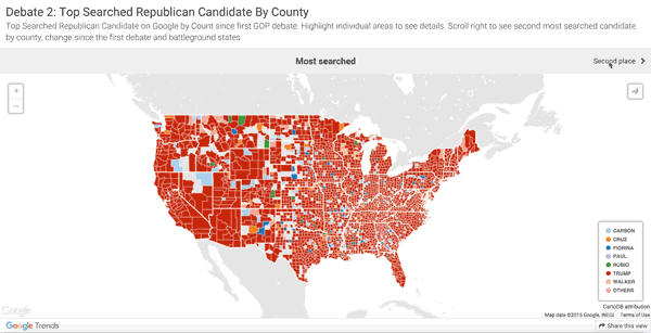
It’s so useful, we’ve got our own version we use for Google News Lab visuals, like this one.


Leave a comment