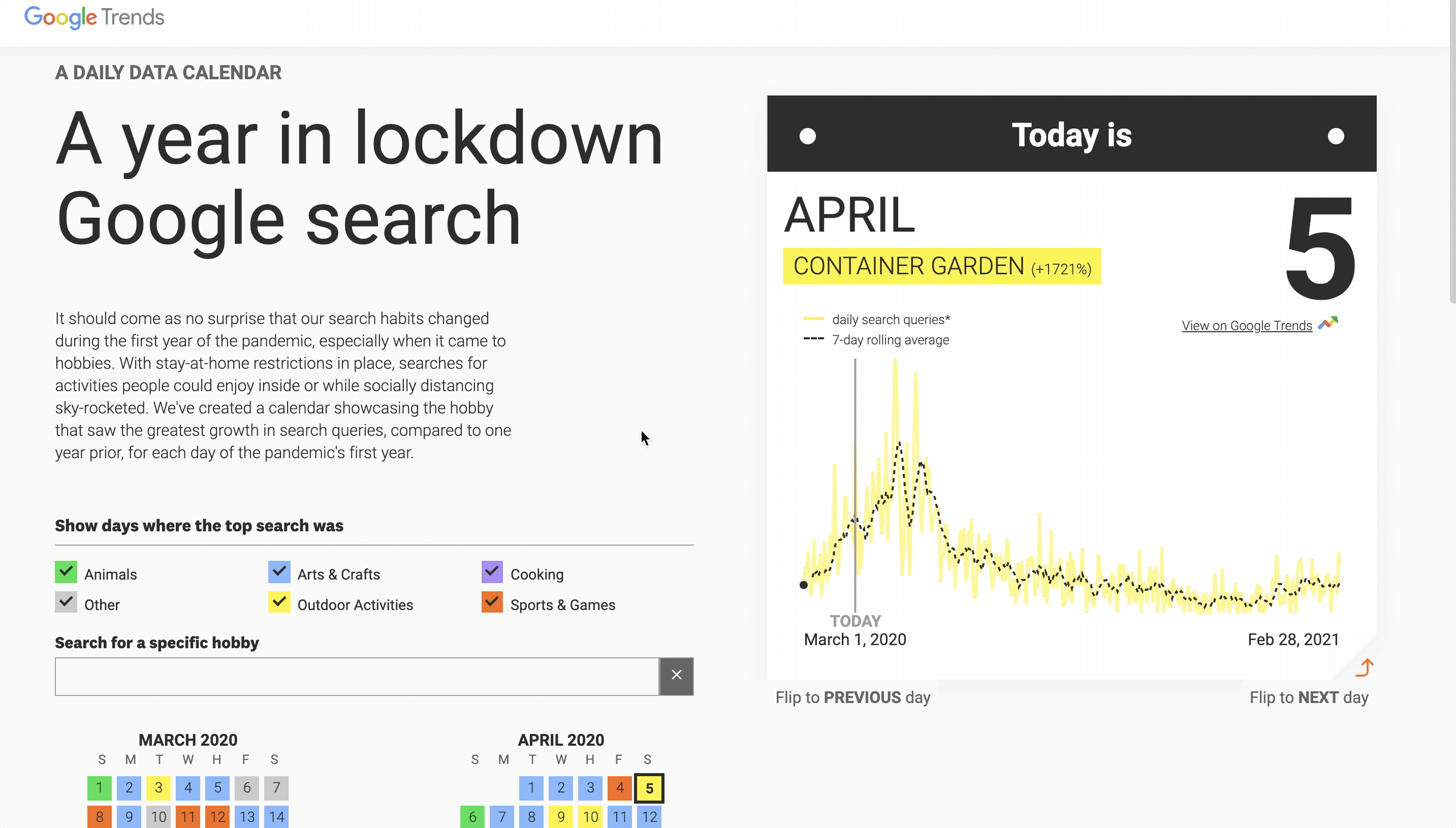
One way to see how our daily lives have changed in the last year of the pandemic is through search data. And that’s what our new visual project does: highlights a key trend that spiked each day. It’s built by Polygraph – creators of The Pudding – and it has some features I really like.
The visual defaults to today’s date when it’s loaded – today’s trend is online poker, for instance. It also uses the calendar view to provide a sense of which types of pastimes were trending over the year and when.
It’s the latest in a series of visual experiments with Google Trends data.
You can read more about this project here.


Leave a comment