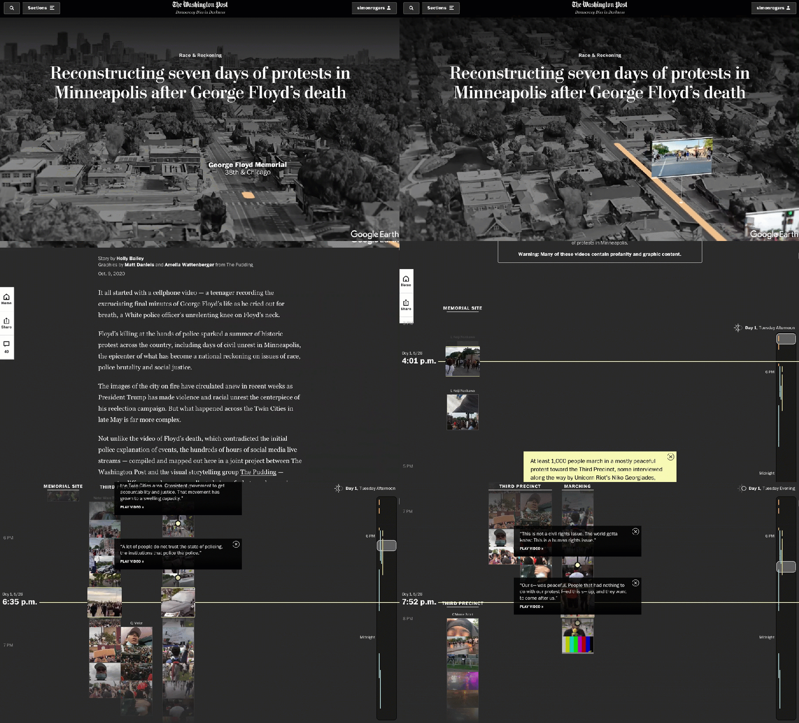
Matt Daniels and Caitlyn Ralph are just two of the team behind The Pudding, a visual collective of great visual data journalism – where you can find longform data journalism such as this hunt for the internet’s oldest image, this guide to why women’s pockets are inferior and how many times a character says “cool” in Community.
And The Pudding crew also have a commercial arm too: Polygraph, which produces visuals such as the ones you can find on this page on the Google Trends site.
Alberto and Simon chat visual journalism with Matt and Caitlyn and find out exactly how you can run a design agency and a cool collective in one go.
The music this week is based on the inflation time series index published by the Bureau of Labor Statistics, and made with TwoTone.
Listen to the latest episode of the Data Journalism Podcast.


Leave a comment