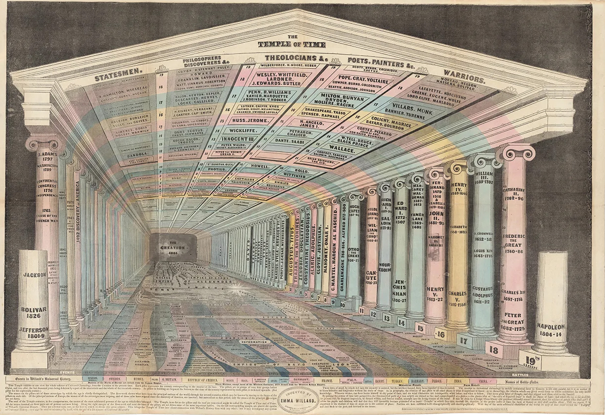
RJ Andrews is the founder of data design studio Info We Trust and author of a new series of books delving into the deep history of of data visualisation and storytelling. In this episode of the pod, he talks about three significant parts of the history of data visuals: Florence Nightingale, Emma Willard and Étienne-Jules Marey. While Nightingale created powerful visuals that changed how we understand mortality, Willard portrayed time itself. And Marey wrote a guide to visualising data that seems current today. You can buy the books here.

The music this week, made with TwoTone, is life expectancy, based on a dataset used in the Nightingale book and provided to us by RJ. Life expectancy at birth is defined as the average number of years that a newborn could expect to live if he or she were to pass through life subject to the age-specific mortality rates of a given period. Data compiled by Our World in Data based on estimates by James C. Riley, Clio Infra, and the United Nations Population Division.
Listen to the latest episode of the Data Journalism Podcast here >>


Leave a comment