Skip to content
Simon Rogers
Home
About
Archives
Contacts
Data Journalism Podcast
What We Ask Google
Speaking & interviews
Training
Animations
Facts are Sacred
On guardian.co.uk
Tag:
data
New event: Join me live in San Francisco, May 6
February 24, 2026
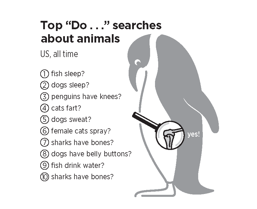
Data + Birds = Beauty
February 12, 2026
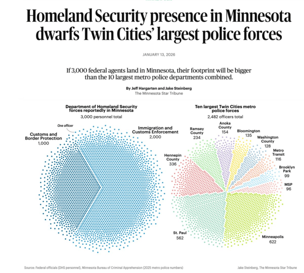
New podcast alert: Data journalism in the face of ICE and subzero temperatures in MN
January 29, 2026
New pages from ‘What We Ask Google’
January 7, 2026
New podcast episode: Data storytelling in 2026
January 5, 2026
Breaking New Ground with the Straits Times
November 14, 2025
How data storytelling has changed
September 10, 2025
New pod episode: Finding Ourselves in Historic Data
June 17, 2025
Datapocalypse! Are we losing our public data?
April 22, 2025
Data+Love+why it matters in the age of AI
March 13, 2025
1
2
3
…
7
Next Page
Subscribe
Subscribed
Simon Rogers
Join 187 other subscribers
Sign me up
Already have a WordPress.com account?
Log in now.
Simon Rogers
Subscribe
Subscribed
Sign up
Log in
Report this content
View site in Reader
Manage subscriptions
Collapse this bar