There’s an interesting piece on the O’Reilly Radar blog this week by Alex Howard on the state of UK open data. Based on a recent report (warning: PDF) by Deloitte’s for the Open Data Institute.
It’s interesting because it paints a state of the nation which – according to a blogpost by researcher Harvey Lewis
… new businesses and new business models are beginning to emerge: Suppliers, aggregators, developers, enrichers and enablers. Working with the Open Data Institute, Deloitte has been investigating the demand for open data from businesses. Looking at the actual supply of and demand for open data in the UK provides some indication of the breadth of sectors the data is relevant to and the scale of data they could be considering.
This is really important stuff: open data is a key part of the government’s transparency agenda and proving that people are interacting with it and the economy may benefit from it is crucial. To bolster the report’s argument, it highlights two charts (which you may or may not like from a design point of view, but that’s not the issue). Firstly there’s this one, which shows the numbers of government datasets published:
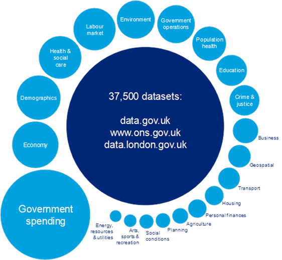
There’s two interesting things about this chart. Firstly the sheer size of government spending. The UK has been pumping out enormous quantities of very granular spending data – every single item of spending over £25,000, for instance. That’s one for each government department for every month since 2010. That’s a lot of spreadsheets, which probably explains why it’s the top item.
The other interesting thing is the inclusion of the Office for National Statistics in the list. For those who don’t know, the ONS is the UK’s national statistical body. It’s been publishing data since 1996 when it was born from the old Central Statistical Office. While it is a data.gov.uk ‘publisher’, I’m not sure it counts as an Open Data provider. Certainly its website is still awful, despite an expensive relaunch a few years ago. But even though it’s content is published on data.gov.uk too, I would be surprised if the boundary files and geo data there is what’s driving the chart below.
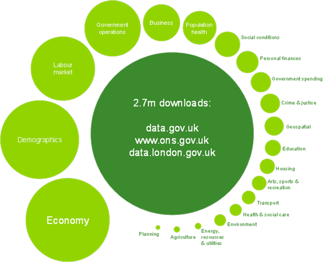
This shows actual downloads of those datasets. And look where government spending is – way down the list behind other types of files. Anyone who has tried to actually use government spending data will tell you why that is. COINS is completely impossible for anyone not used to big datasets to do anything with, and the spending over £25,000 spreadsheets need to be joined together to produce anything meaningful.
Now, here’s what I think those categories really mean:
Economy: The ONS publishes GDP, inflation, the deficit and other economic data almost daily. It’s in the news and a lot of people rely on it. We write about them every month and others must link to them too.
Demographics: The ONS publishes a huge amount of demographic data, such as the Census results or population estimates
Labour market: That’s unemployment data to you and I, which comes out every month. These are the ONS’ big releases – they will always get the most traffic as they produce so many news stories.
On the other hand, a report by the National Audit Office I wrote about last year found a slightly different picture.
While data.gov.uk had more than 1.75m visits since it was launched in January 2010 and before the report came out, most of its visitors leave from either the home page or the data page on the website. Page views for transparency data on the Ministry of Justice website represented just 0.02% of the overall site traffic from April to September 2011. The report says
This suggests that they are not accessing data during their visit, although it does not take account of other potential access points for the data, for example, linked third party websites or applications
The NAO does point out that
there has been much greater interest in releases related to the operation of public services. The police crime map website has had an estimated 47m visits between February and December 2011. The Department for Education has reported an 84% increase in the use of its comparative data on schools, compared with the same period last year, since it was consolidated in one location and data were made more accessible
So, most people use the tools rather than the data itself. And why’s that? Because government data releases even in the UK are often messy and difficult to use.
To point that out is not to attack open data – we just need more of it and we need it to be really, actually and truly open. And we need to be honest about it too.


Leave a comment