 We published an interactive map this week showing the world’s response to Typhoon Haiyan earlier this year. Click on a link and it shows combinations of the word “help” (in 22 languages) with terms around the disaster. The lines symbolically represent the flood of response going from each continent around the world to the Philippines. Created by Nicolas Belmonte, it’s a beautiful picture of something incredibly moving: the desire to reach out when an awful event happens. Technically its also incredibly interesting — Belmonte used an ‘edge bundling’ technique to group the lines together. It is based on an algorithm which “creates a proximity graph for the edges where each of the edges is represented by a node”. I.e. it groups lines together that are coming from similar places.
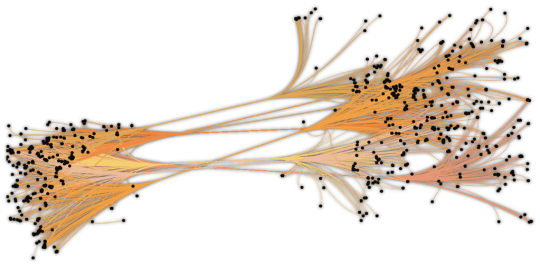
On the Philippines map at the top of the page that means it groups lines from, say, America to the islands themselves. It makes the whole thing easier to understand.

And the code behind this is something anyone can use, via this github page. A load of lines can often just look like… a load of lines. But this helps bring the patterns behind them to life.


Leave a comment