//
you're reading...
Data journalism, Data visualisation, Innovation, Mapping

Mapping live George Floyd protest videos

The Washington Post’s Interactive Spatial Video explorer

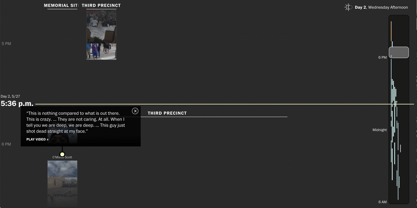
Recreating live news events online is hard – but bringing them to life so you canfeel them is harder. Just published by the Washington Post and designed by The Pudding (and supported by my team at the Google News Initiative), this visual joins together Google Earth studio animations and places YouTube live videos on location so you can see how the protest after George Floyd’s death spread across the city. It’s a combination of great work by some of my favourite interactive designers and includes some nifty navigation tricks like the bars on the right that really help see the events as they happened.

About Simon Rogers

Data journalist, writer, speaker. Author of 'Facts are Sacred', from Faber & Faber and a range of infographics for children books from Candlewick. Edited and launched the Guardian Datablog. Now works for Google in California as Data Editor and is Director of the Sigma awards for data journalism.

Discussion

No comments yet.

Leave a comment

About me

Data journalist, writer, speaker. Author of 'Facts are Sacred', published by Faber & Faber and a new range of infographics for children books from Candlewick. Data editor at Google, California. Formerly at Twitter, San Francisco. Created the Guardian Datablog. All opinions on this site are mine, not my employers'. Read more >>

Free to share

Creative commons

Please share me around. Everything here is free to use under a Creative Commons Attribution-NonCommercial 3.0 Unported License

Follow me on Twitter