Skip to content
Simon Rogers
Home
About
Archives
Contacts
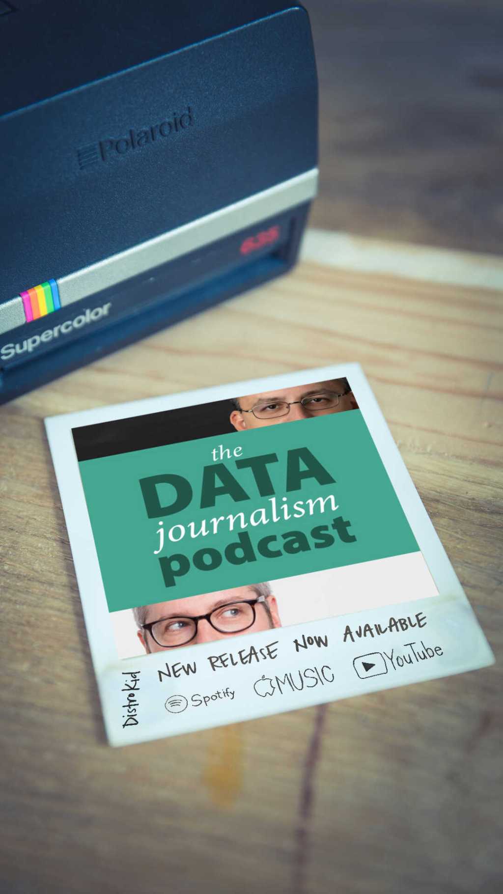
Data Journalism Podcast
What We Ask Google
Speaking & interviews
Training
Animations
Facts are Sacred
On guardian.co.uk
Category:
Data visualisation
The Cool Grey City of Data: inside the San Francisco Chronicle’s data team
April 29, 2024
Sonified: how we made a data album
February 4, 2024
Data journalism for CNN
January 10, 2024
Holiday special: why data storytelling matters
December 18, 2023
“Hungary is a data journalism superpower”
December 4, 2023
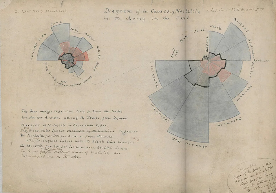
Florence Nightingale and the history of dataviz
March 13, 2023
The science of dataviz, with Jen Christiansen
February 27, 2023
Nigel Holmes: the joy of data
December 15, 2022
Nathan Yau: the flow of dataviz
November 25, 2022
Amanda Cox: bringing facts to the people
October 31, 2022
Previous Page
1
2
3
4
…
8
Next Page
Subscribe
Subscribed
Simon Rogers
Join 187 other subscribers
Sign me up
Already have a WordPress.com account?
Log in now.
Simon Rogers
Subscribe
Subscribed
Sign up
Log in
Report this content
View site in Reader
Manage subscriptions
Collapse this bar