One of the greatest features of data is that pretty much anything can represent it. It can be great journalism; it could be glass sculptures representing sea level rises, paint representing a battle with long COVID – and it can even be music.
And now we have turned that music into a playlist album: Sonified.
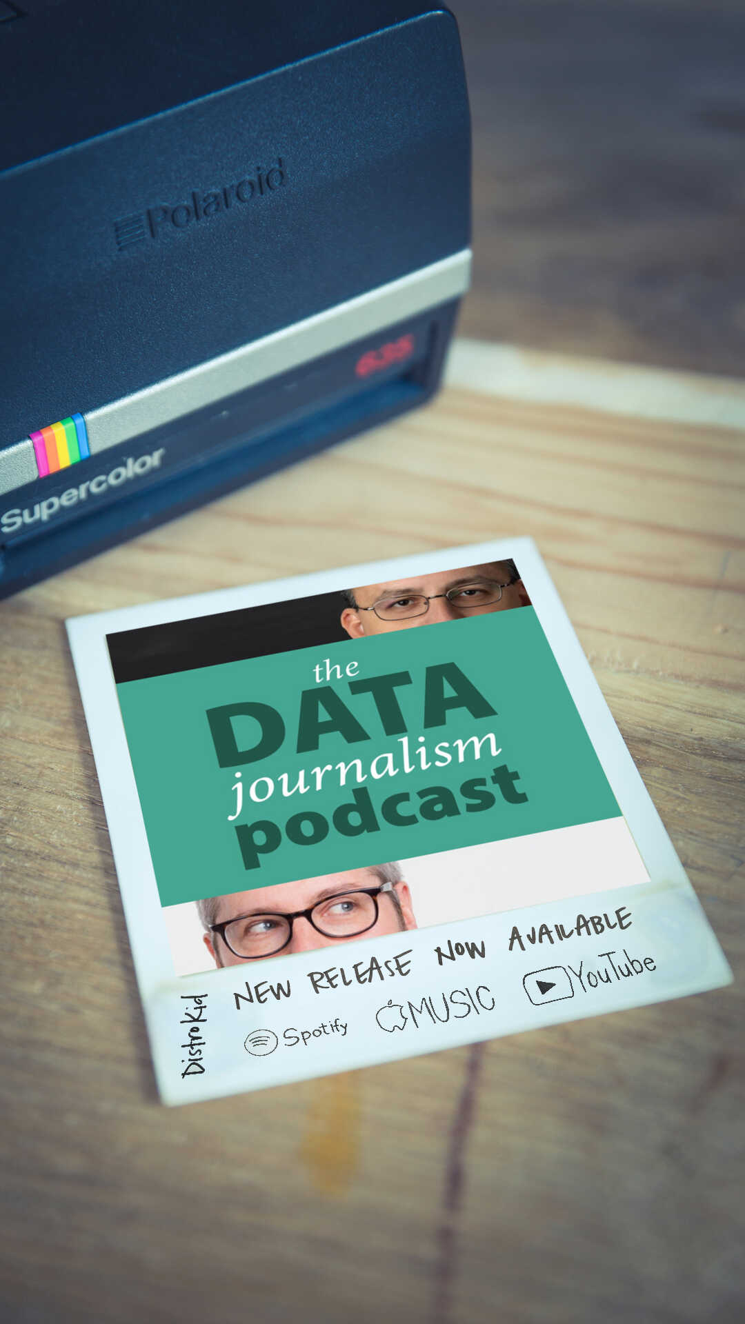
If you listen to the Data Journalism Podcast I co-host with Alberto Cairo, then you will be familiar with how we make the theme for each episode: each guest chooses a dataset and we then use a tool called TwoTone to turn that data into music.
Is it great music? Probably not. Is it even the best way to represent the data? Probably not. Is it interesting? I think so.
The first track, Pulsars, is based on data provided by Jen Christiansen at Scientific American, who we interviewed for this episode. It represents ‘Radio Observations of the Pulse Profiles and Dispersion Measures of Twelve Pulsars’. Each datapoint is rendered to become a note, which become a series of notes, which come together to form the track. Now the traditionalists among you may be thinking ‘but I want to hear a particular datapoint and to know the value of that datapoint’. If so, you’ve come to the wrong place. But if you want to hear the patterns in the data, the rising and falling of the measurements, then you may just find something beautiful in it.
And you may recognise it for another reason: this dataset and the plot by Hal Craft is also used on the cover of the Joy Division album Unknown Pleasures:
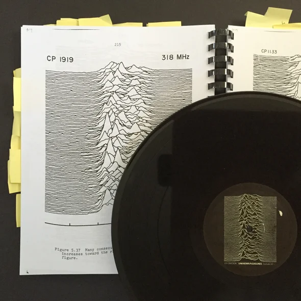
Photograph by Jen Christiansen
In one sense, this is closer to art than to traditional data visualisation. You would be hard pressed to identify actual datapoints in either the original visualisation or the music. But that’s not the point – it represents the data. In the case of Craft’s original, the line plots were computer generated, although then plotted again by hand to make them more legible. In Christiansen’s interview with Craft, he says he did that because: “I tilted them off at a slight angle like that so that it would look like you were looking up a hillside – which was aesthetically interesting and pleasing, but on the other hand, it just confused the whole issue.” Christiansen’s piece is worth reading in full and explains the science behind the charts in the detail it deserves.
It’s also really beautiful, and why shouldn’t data be beautiful? The ‘magic’ that Alberto describes in his latest book The Art of Insight is really a happy set of accidents and coincidences; the chance happenings when you put data together with humans. And each representation of that data will look different for each visualiser that puts it together. It’s why Shirley Wu’s work looks different to Nadieh Bremer’s, despite their close associations. The numbers may represent ‘truth’ (whatever that is), but each data visualisation is the result of human interpretation.
And data sonification is no different.
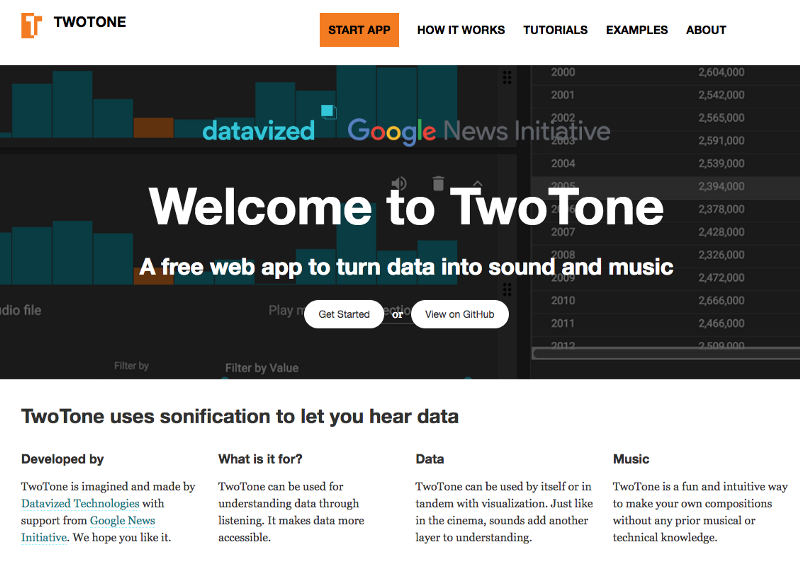
We launched TwoTone back in 2019 and since then the team at Sonify have made it an incredibly powerful application – which can use 16 channels of MIDI simultaneously. It works like this: you upload a dataset, ideally a time series, into the tool. Each line of data can be represented by a musical instrument. You can adjust the cadence and pitch of each instrument, adding more and more layers until it really takes on a life of its own.
Sonify have also embarked on probably the most significant work around data sonification in the field. One example is the year-long Knight-funded project in Wichita Kansas to work with the blind and visually-impaired community to test new approaches for communicating data with sound.
This is just one example: the FT’s Alan Smith has turned the yield curve into sound, and Mona Chalabi and Emma Lee Moss have also combined to produce sound and visual representations of data around migrant workers.
These are just our first attempts. But let us know what you’ve done with data and sound in the comments below too.


Leave a comment