Skip to content
Simon Rogers
Home
About
Archives
Contacts
Data Journalism Podcast
What We Ask Google
Speaking & interviews
Training
Animations
Facts are Sacred
On guardian.co.uk
Month:
January 2013
Data journalism and James Cameron: a world of questions
January 31, 2013
Is the ONS really open data?
January 29, 2013
Gallery: new images from Facts are Sacred
January 28, 2013
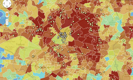
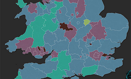
Borders and boundaries: 16 Google Fusion border files for you to use
January 28, 2013
How to make a map with Google Fusion tables
January 27, 2013
Data journalism: 22 key links
January 27, 2013
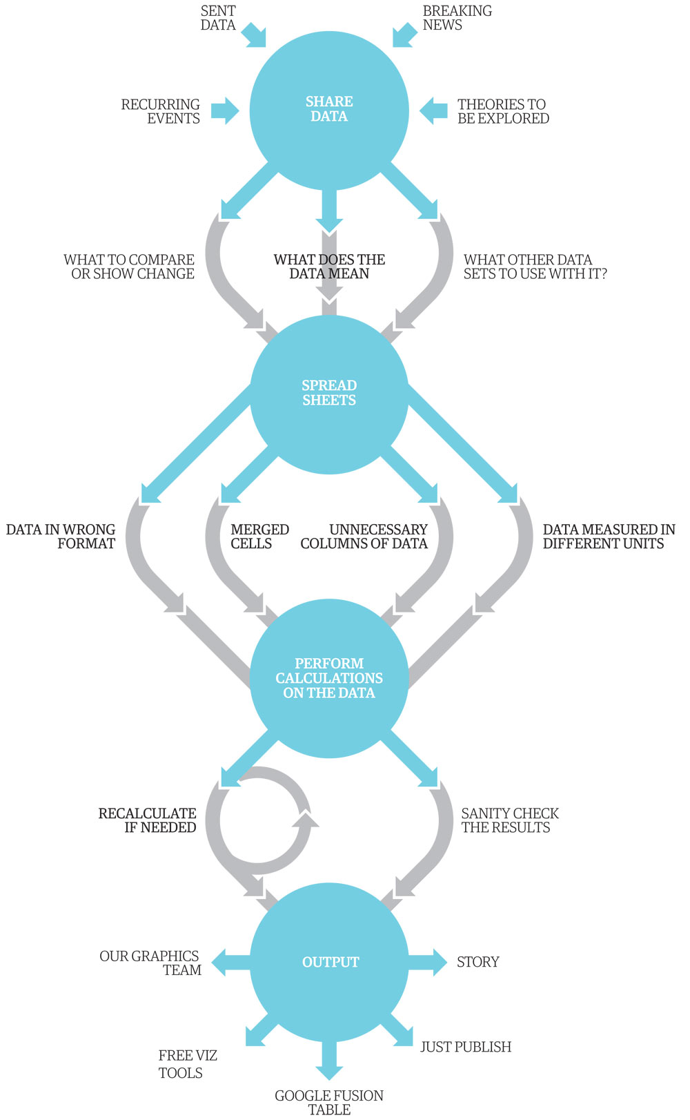
A data journalism workflow
January 27, 2013
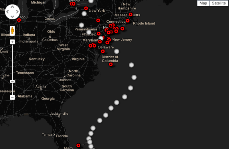
Mapping a disaster
January 26, 2013
How to put girls off from all forms of programming/tech by Emma der Mulqueeny
January 25, 2013
Anyone can do it. Data journalism is the new punk
January 24, 2013
1
2
Next Page
Subscribe
Subscribed
Simon Rogers
Join 187 other subscribers
Sign me up
Already have a WordPress.com account?
Log in now.
Simon Rogers
Subscribe
Subscribed
Sign up
Log in
Report this content
View site in Reader
Manage subscriptions
Collapse this bar