Skip to content
Simon Rogers
Home
About
Archives
Contacts
Data Journalism Podcast
What We Ask Google
Speaking & interviews
Training
Animations
Facts are Sacred
On guardian.co.uk
Category:
Data visualisation
How Axios brings smart brevity to data journalism
September 15, 2022
New episode: Inside the New York Times Graphics Team
August 25, 2022
Information is Beautiful: an interview with David McCandless
June 8, 2022
Inside The Pudding
November 17, 2021
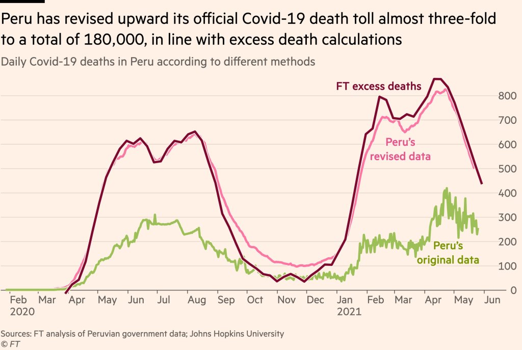
COVID data journalism special podcast episode
June 8, 2021
Taking the numb out of numbers
May 17, 2021
How to make data journalism for humans
May 14, 2021
Introducing The Data Journalism Podcast
April 26, 2021
Visualised: how we are searching for Election 2020
October 28, 2020
Mapping live George Floyd protest videos
October 12, 2020
Previous Page
1
2
3
4
5
…
8
Next Page
Subscribe
Subscribed
Simon Rogers
Join 187 other subscribers
Sign me up
Already have a WordPress.com account?
Log in now.
Simon Rogers
Subscribe
Subscribed
Sign up
Log in
Report this content
View site in Reader
Manage subscriptions
Collapse this bar