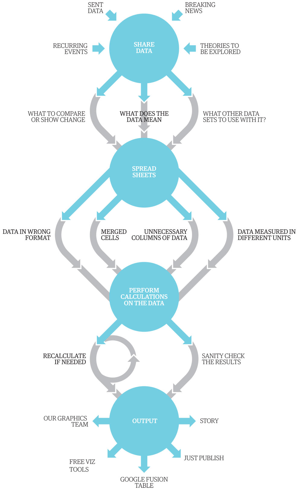
The Data Journalism workflow was originally designed by Guardian graphic artist Mark McCormick to illustrate our work on the Datablog. It’s since found its way into talks, presentations and the Data Journalism Handbook.
Now it’s been translated by reporters around the world. This is all I’ve found so far – have you seen more (and can you translate it into other languages?). I’ll add more as I get them.
Scroll down to see the charts
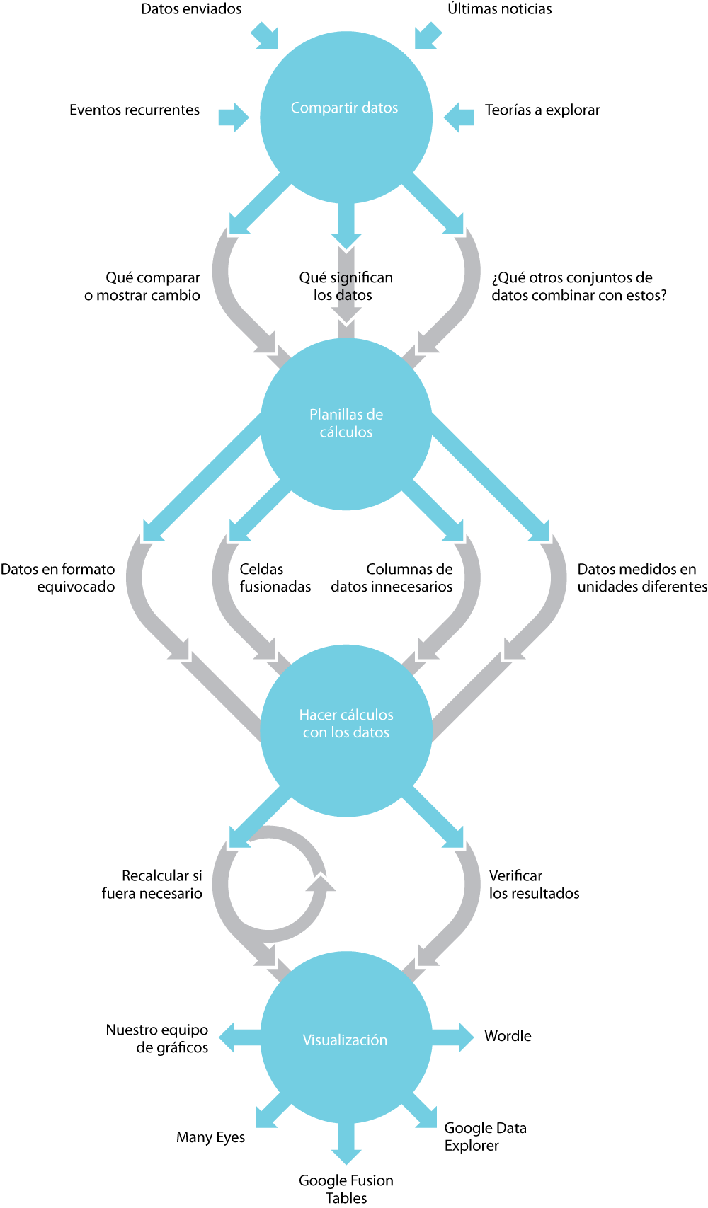
Spanish
By the La Nacion data team, Argentina
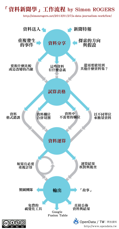
Chinese
By opendata.tw, Taiwan
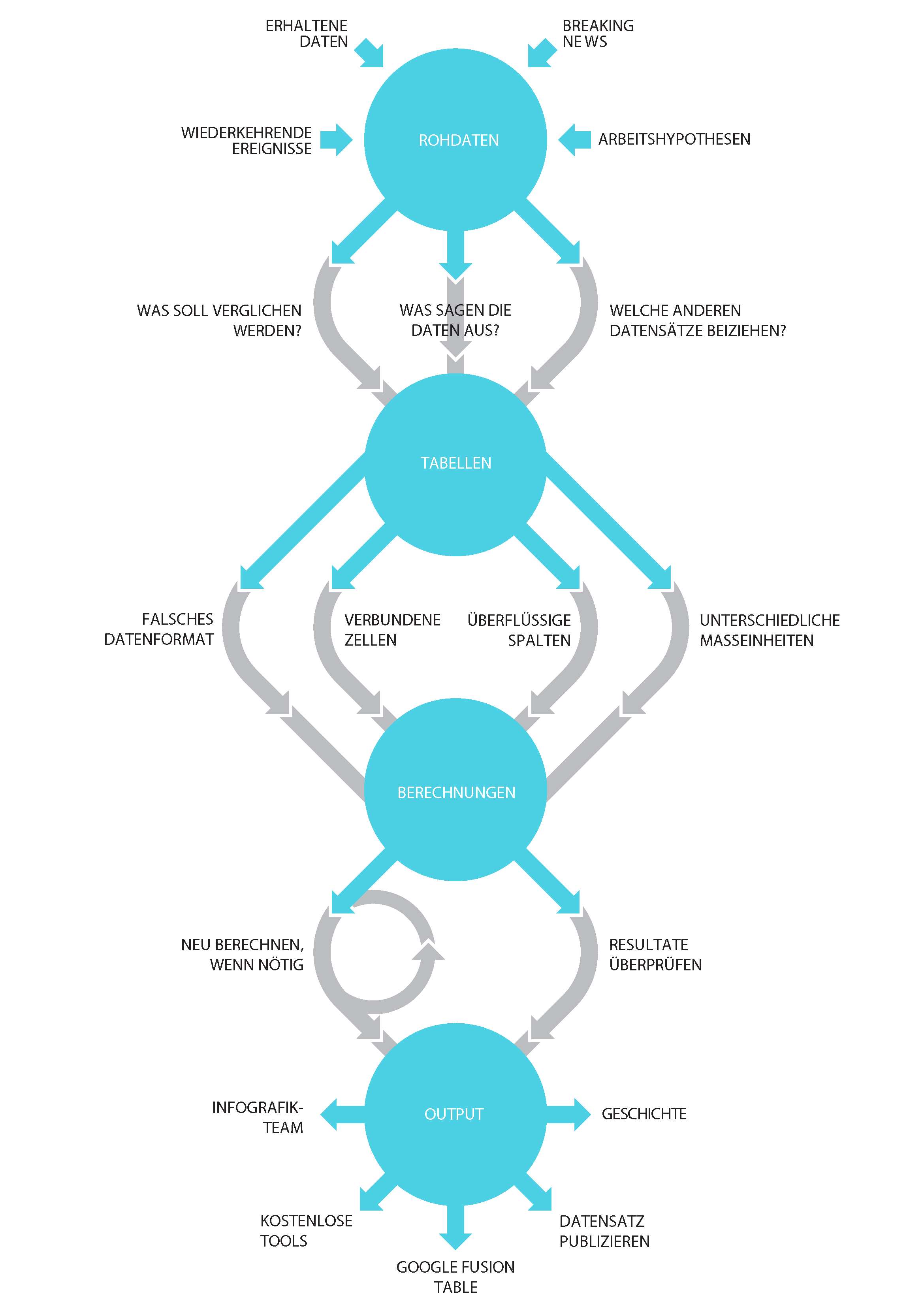
German
By David Bauer, Switzerland


Leave a comment