Skip to content
Simon Rogers
Home
About
Archives
Contacts
Data Journalism Podcast
What We Ask Google
Speaking & interviews
Training
Animations
Facts are Sacred
On guardian.co.uk
Author:
Simon Rogers
Taking the numb out of numbers
May 17, 2021
How to make data journalism for humans
May 14, 2021
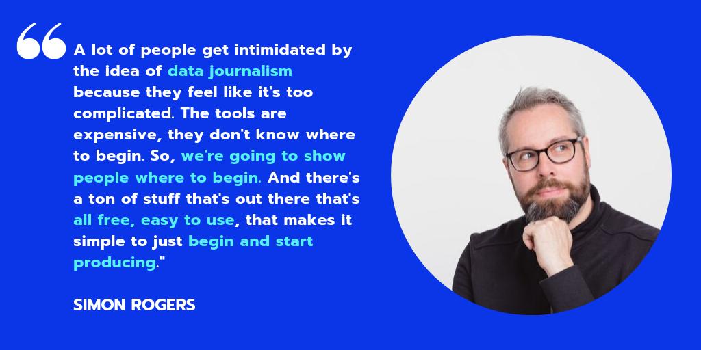
Introducing The Data Journalism Podcast
April 26, 2021
New visual: A pandemic year of Trends
April 19, 2021
How do you track GDP in realtime?
April 8, 2021
Visualised: how we are searching for Election 2020
October 28, 2020
Mapping live George Floyd protest videos
October 12, 2020
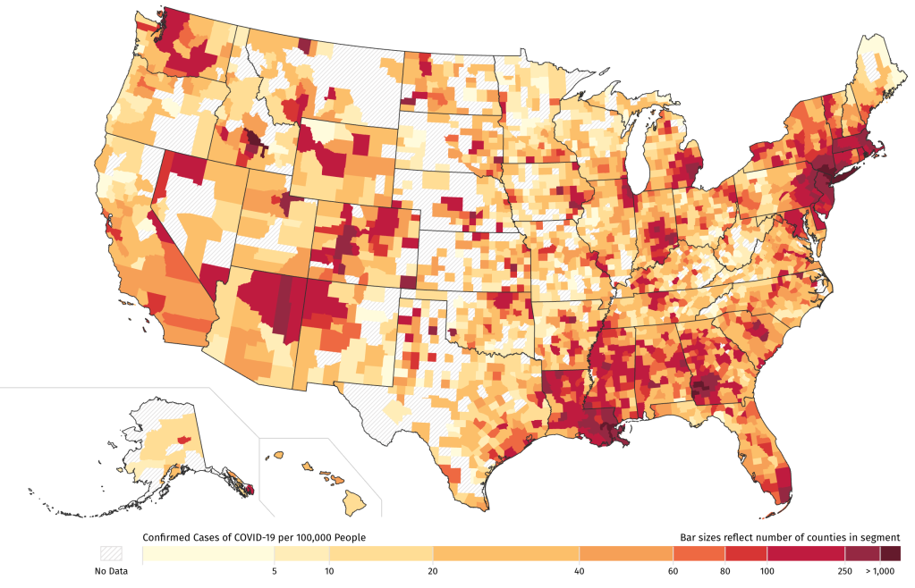
How local journalists can map COVID-19 cases
April 15, 2020
A new free online course in Data Journalism
September 26, 2019
A decade of working in data journalism: what has changed?
April 24, 2019
Previous Page
1
…
4
5
6
7
8
…
14
Next Page
Subscribe
Subscribed
Simon Rogers
Join 187 other subscribers
Sign me up
Already have a WordPress.com account?
Log in now.
Simon Rogers
Subscribe
Subscribed
Sign up
Log in
Report this content
View site in Reader
Manage subscriptions
Collapse this bar