//
you're reading...
Data journalism, Data visualisation, Government data, health, Open data

How local journalists can map COVID-19 cases

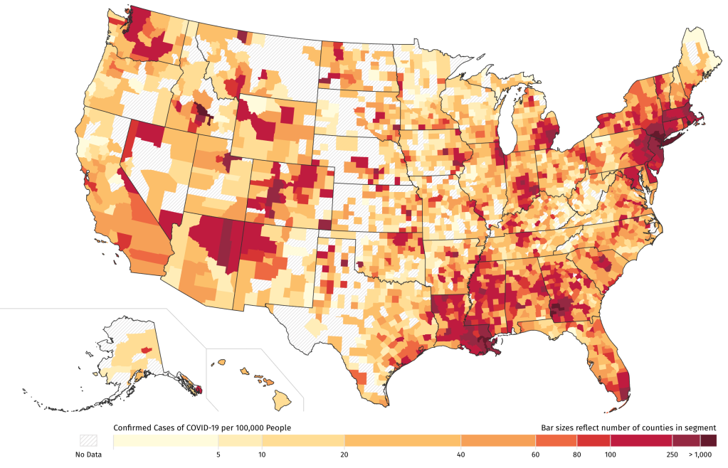
The Coronavirus outbreak is a fast-moving story for any newsroom to cover, particularly for local reporters trying to help their readers make sense of what’s happening in their area. And for those local reporters wanting to show their readers where cases are, the options for an embeddable local coronavirus map are limited and time-consuming.

So Stanford University’s Big Local News and Pitch Interactive—with support from the Google News Initiative—created the COVID-19 Case Mapper to make it possible for local journalists to easily embed up-to-date Coronavirus map visualizations on their sites for readers. The data is from the New York Times’ recently-published open COVID-19 county dataset

Read more here >>

About Simon Rogers

Data journalist, writer, speaker. Author of 'Facts are Sacred', from Faber & Faber and a range of infographics for children books from Candlewick. Edited and launched the Guardian Datablog. Now works for Google in California as Data Editor and is Director of the Sigma awards for data journalism.

Discussion

No comments yet.

Leave a comment

About me

Data journalist, writer, speaker. Author of 'Facts are Sacred', published by Faber & Faber and a new range of infographics for children books from Candlewick. Data editor at Google, California. Formerly at Twitter, San Francisco. Created the Guardian Datablog. All opinions on this site are mine, not my employers'. Read more >>

Free to share

Creative commons

Please share me around. Everything here is free to use under a Creative Commons Attribution-NonCommercial 3.0 Unported License

Follow me on Twitter