Simon Rogers
Home
About
Archives
Contacts
Data Journalism Podcast
What We Ask Google
Speaking & interviews
Training
Animations
Facts are Sacred
On guardian.co.uk
Category:
Data visualisation
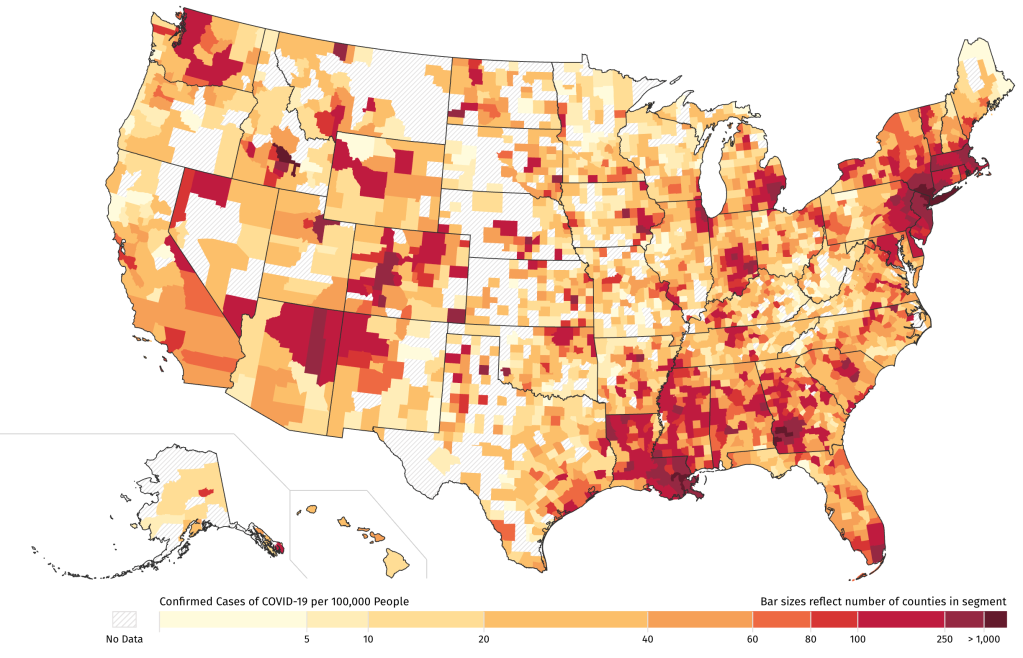
How local journalists can map COVID-19 cases
April 15, 2020
A new free online course in Data Journalism
September 26, 2019
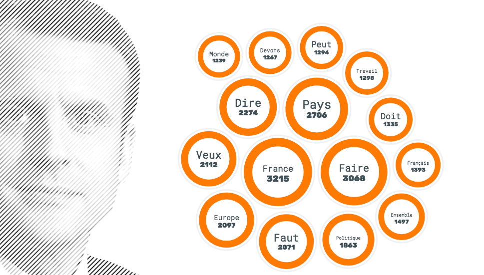
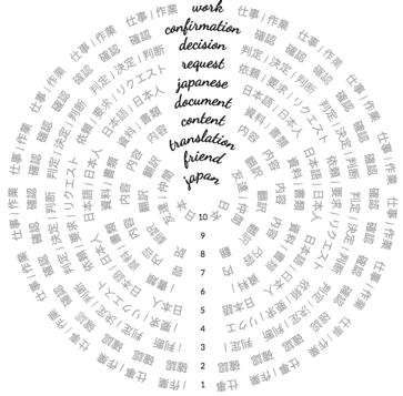
The weight of words (and data)
June 8, 2018
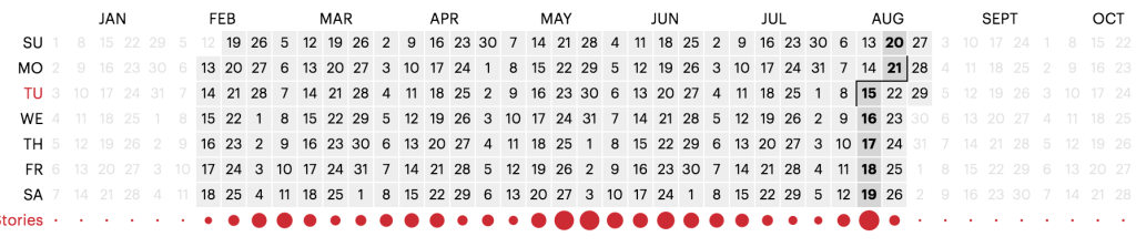
Want to build a VR network chart? Here’s a way to do it without coding
March 6, 2018
Visual journalism gallery: images from the world’s best newsrooms and designers
November 14, 2017
A new machine learning app for reporting on hate in America
August 29, 2017
Data needs empathy to make it real
April 25, 2017
Gallery: visualising technology and our changing world
February 7, 2017
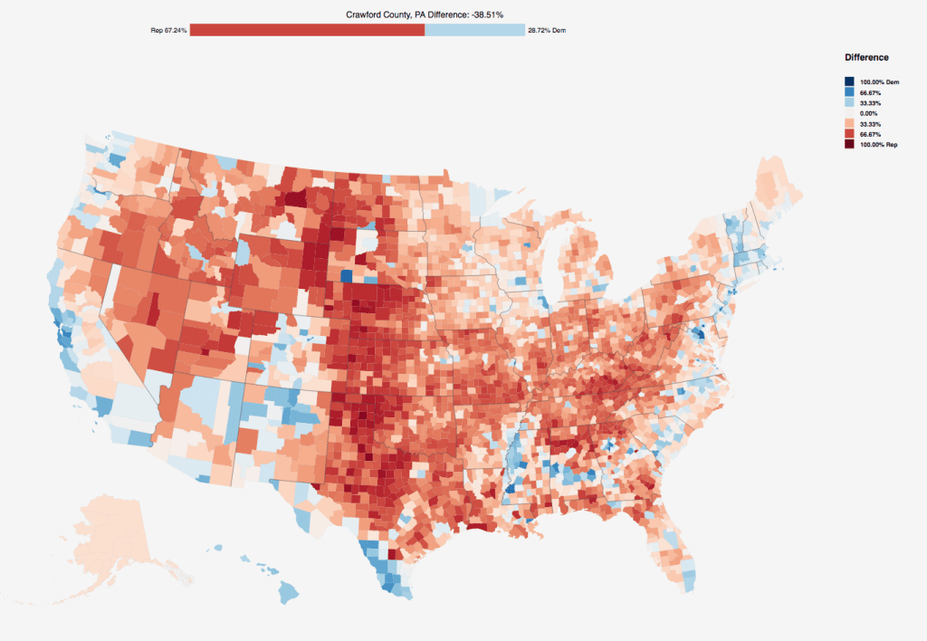
US election 2016: How to download county-level results data
November 16, 2016
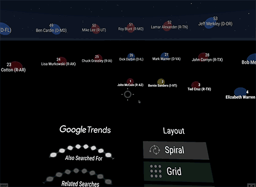
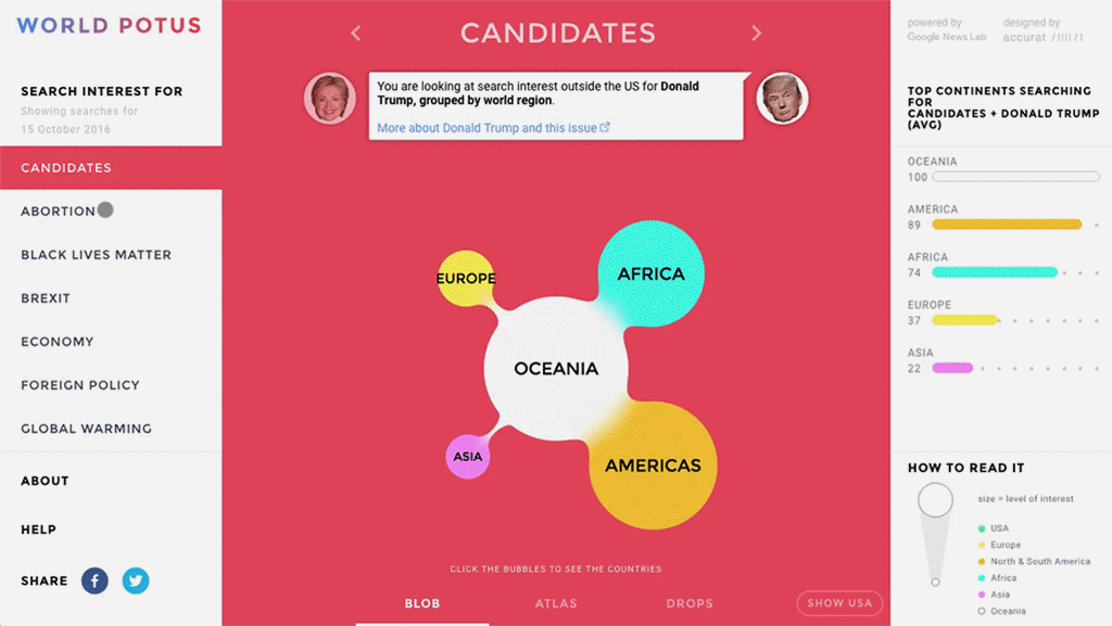
How is the world searching for the US Presidential Election? A Data Visualisation from the Google News Lab.
October 18, 2016
Previous Page
1
2
3
4
5
6
…
8
Next Page
Subscribe
Subscribed
Simon Rogers
Join 187 other subscribers
Sign me up
Already have a WordPress.com account?
Log in now.
Simon Rogers
Subscribe
Subscribed
Sign up
Log in
Report this content
View site in Reader
Manage subscriptions
Collapse this bar