The US Presidential election is not just being watched in America. From Indiana to India, each development is being intently followed by people across the globe.
Those people are also searching about the election online — and that’s whereworldpotus.com comes in.
Along with Accurat, a design group headed by Gabriele Rossi, Simone Quadri and Giorgia Lupi (of Dear Data fame), we built a data visualisation that shows search interest in the U.S. Presidential candidates and top political issues. The data viz is part of a series of experiments to work with great designers to find new ways of using Google data in newsrooms.
This series also offers our team an opportunity to work with Alberto Cairo, the Knight Chair in Visual Journalism at the University of Miami, who is serving as a consultant art director on each project. He’s someone I’ve wanted to work with for a while and this is an exciting time to be telling stories with the world’s biggest journalistic dataset.
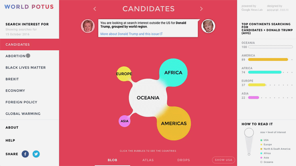
World Potus allows the user to explore the data in three distinct ways, each of which provide a different perspective on how users are searching about the US Presidential Election across the world.
- In the Blob view, the proximity of the bubbles is based on similarity in search habits across all topics; the closer they are to each other, the more similar the search habits in the countries are to each other.
- In the Atlas view, countries and world regions are organised by geography and divided into 5 regions: Americas, Africa, Asia, Europe and Oceania.
- In the Drops view, bubbles are distributed vertically depending on the search trends in the previous 24 hours (higher is rising, lower is falling).
(In the default view, the visual does not include the USA. But a switch can turn that on and off. It’s the world as you have never seen it before.)
The team faced a number of fascinating technical challenges, but the primary one was rendering the gooey blobs that represent the search interest relative to all world countries smoothly on multiple devices. This was important in reflecting the data: conversations and opinions around controversial topics are shapeless and ever-changing, so showing these blobs properly has been one of the main goals of Accurat’s design and web development efforts.
Gabrielle Rossi from Accurat notes that, “most of the existing tests and examples in this direction are built using SVG filters but, through experimentation, Accurat found that WebGL shaders have wider browser support and much better performances for these type of effects. It also gave us a nicer and smoother result in the end.” (You can find the source code for the application, built with React and WebGL, on the Google Trends GitHub.)
More broadly, this data visualisation comes around a time that Giorgia Lupi has called “post peak infographic”. Traditional information graphics were designed to represent very precise data. But increasingly they need to visualise data that is more fluid, malleable and harder to pin down. Realtime Google Trends data is just one of these new sources — and visualizations will need to be able to reflect that shift.
Part of that challenge is moving away from capturing “preciseness” and capturing the “spirit” of the data. Lupi says it is important for the team to move away from reflecting “the precise number represented by the index” and toward “a ‘softer’ depiction of data” reflecting “the fluidity and fuzziness of conversations around the world.” For Alberto Cairo, this emphasis allowed the data visualisation to strike a “balance” between making things “clear and readable, but also pleasurable and fun”.
As I mentioned earlier, World Potus is the first in a series of data visualizations from the Google News Lab. Upcoming projects will include collaborations with data artists like Moritz Stefaner and Jan Willem Tulp.
There will also be more from Wes Grubbs and the terrific team at Pitch Interactive. Ahead of the debate this week, you can check out their real-time election visual here.
Be sure to follow us on Twitter to see the new work as soon as we publish.
Simon Rogers is the Data Editor at the Google News Lab and is director of the Data Journalism Awards.


Leave a comment