Simon Rogers
Home
About
Archives
Contacts
Data Journalism Podcast
What We Ask Google
Speaking & interviews
Training
Animations
Facts are Sacred
On guardian.co.uk
Category:
Data visualisation
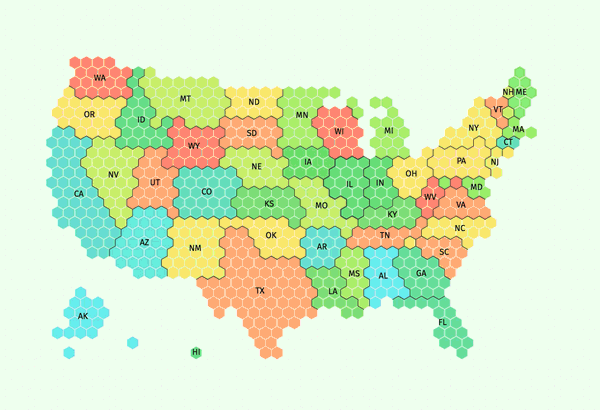
Tilegrams: Make your own cartogram hexmaps with our new tool
September 22, 2016
Election DataBot: harnessing the power of the matrix
September 8, 2016
Building an Alternative Olympic Medal Table
August 12, 2016
Data Journalism Awards 2016: what the winners tell us about the state of the data nation
June 16, 2016
Podcast: It’s never been a better time to be a data journalist
June 1, 2016
Three refugee datasets for the 19 Million Project
November 2, 2015
How to make a multi-screen interactive
September 19, 2015
Data journalism in China
June 28, 2015
A data journalist at Twitter
March 9, 2015
Gallery: Space, the universe and everything visualized
February 25, 2015
Previous Page
1
…
3
4
5
6
7
8
Next Page
Subscribe
Subscribed
Simon Rogers
Join 187 other subscribers
Sign me up
Already have a WordPress.com account?
Log in now.
Simon Rogers
Subscribe
Subscribed
Sign up
Log in
Report this content
View site in Reader
Manage subscriptions
Collapse this bar