Skip to content
Simon Rogers
Home
About
Archives
Contacts
Data Journalism Podcast
What We Ask Google
Speaking & interviews
Training
Animations
Facts are Sacred
On guardian.co.uk
Category:
How to guides
A new free online course in Data Journalism
September 26, 2019
Can data journalism be taught?
January 10, 2018
How to make a multi-screen interactive
September 19, 2015
The five Ws of data journalism
October 16, 2014
How to make an animated map with CartoDB and Torque
March 17, 2014
How to make a data journalism animation: women and equality
March 9, 2014
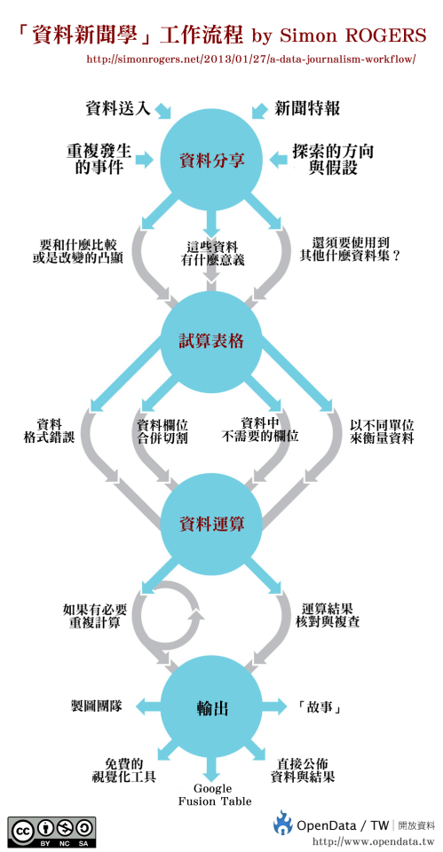
Chart: A data journalism workflow – translated into different languages
May 20, 2013
Data journalism: a video guide to its practice and history
April 8, 2013
CartoDB v Google Fusion: how to map every meteorite
February 18, 2013
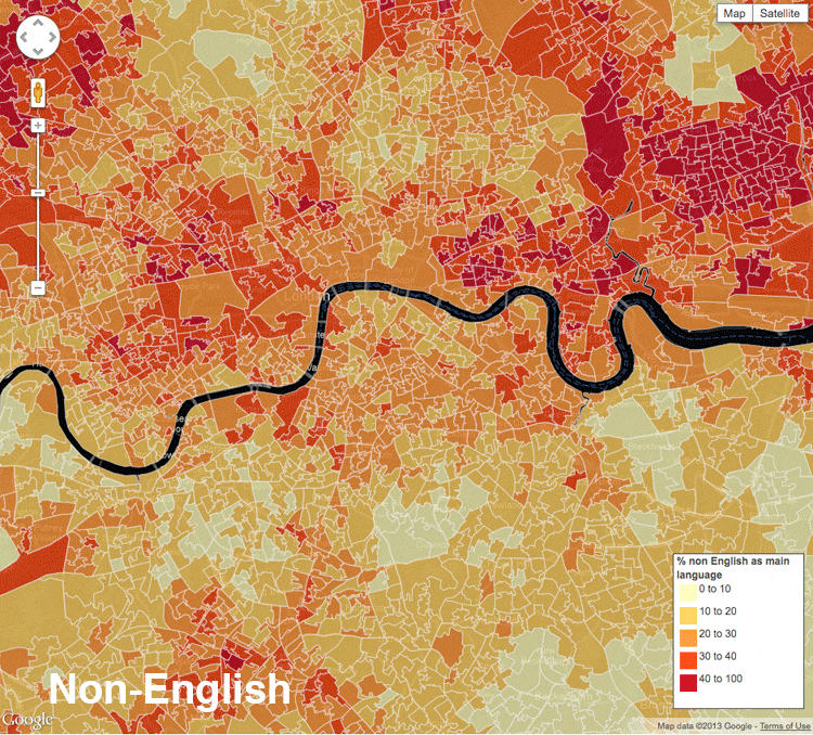
Mapping the census: how we did it (in three steps)
February 4, 2013
1
2
Next Page
Subscribe
Subscribed
Simon Rogers
Join 187 other subscribers
Sign me up
Already have a WordPress.com account?
Log in now.
Simon Rogers
Subscribe
Subscribed
Sign up
Log in
Report this content
View site in Reader
Manage subscriptions
Collapse this bar