This is taken from materials for an introduction to data journalism, a MOOC course run earlier this year. You can read more about the course here.
1) Who?
Where did the data come from? Why does this matter? This could be the most important W. Because data, like any kind of information, can be wrong and the less reliable the source, the less likely it is to be correct. Transparency about this is important too – if your reader can see where the data came from then they are more likely to believe you. If they don’t believe you, then what you are doing is worthless.
It’s important because much data journalism has its roots in publicly available data – and freedom of information legislation around the world which has allowed journalists to create stories from hidden government data.
But having an open data portal doesn’t automatically make you a haven of freedom – even Bahrain and Saudi Arabia now have open data portals. This is where data journalists come in – by exposing and interrogating the data, we can test how accurate it is, mash it up with other datasets to produce results that tell you something new about the news.
Because, traditionally journalists have treated data with a kind of breathless trust which they would never accord a human source. Numbers are trusted, because investigating them is too scary. Former BBC reporter Michael Blastland, examined the norovirus – or winter vomiting bug – outbreak of 2008, showing exactly how easy it is to get the numbers wrong. The story was that three million people had gone down the previous year with the disease.
He looked at the confidence intervals – the guide to how reliable these numbers were – and realised that the number could just as easily be 280,000. Or even 34 million. The truth? Nobody knew, but the story had been written up anyway.
2) What?
What are you trying to say? What points are you trying to get across? You are not academics patiently laying out every form of argument. The best data journalism tells a story in a clear way that can be followed easily, which is not something that is true of every academic report into any subject. While statistical reports are not aimed at the general public – your work is. Your job is to edit down the raw information and make it comprehensible.
Here’s an example: The Art Market for Dummies was a winner in the 2013 Data Journalism awards. This project took data from various sources and stitched it together into a visual whole that tells a story. The project used readily available data on the art market scraped from a database named Artprice. Plus it converted PDF files to Excel file. The author also involved experts to help him translate the jargon and lingo of the artworks. He had to use tools such as
Outwit, a Firefox Add-on to convert pdf files to Excel; Open Refine to clean and merge datasets and the Google API Currency Converter for uniform monetary values. D3.js and Hichcharts.js were used to visualise the data.
It was the author’s role in translating that data for everyone that made him a data journalism winner. Your job is to bridge the gap between the data and the user, which means telling the what.
3) When?
How old is your data? By the time you get an official dataset, the chances are that it is at least one year old, which is an age away in a time of rapidly breaking news stories and instant reaction. That’s partly why data journalists are increasingly interested in more up-to-date methods of collecting data, ie:
– near-realtime data, gleaned from official feeds, such as this homicide map of Chicago, based on the latest immediate crime reports from the city. Collated into a constantly-updated map (which also allows the user to download the data), this data provides a constant and rolling source of news stories for the journalists involved, such as this story here, written after an unusually high period of murders in one area of the city.
– social media data collected in real-time from social media services, can provide instant monitoring of breaking news stories, sources for journalists and an analysis of attitudes towards a given event. Business news site Quartz looked at Tweets posted by @J_tsar, the Twitter account reportedly linked to Boston marathon bomber Dzhokhar Tsarnaev, and worked out his sleep patterns based on the timing of his tweets.
– sensor journalism. New cheap technology can create immediate data for analysis and reporting. The WNYC data team produced this project monitoring the emergence of cicadas across the east coast – and encouraged their users to help them in the project by building their own cheap sensors. This is actually a new kind of data journalism: sensor journalism and John Keefe’s team have pioneered the way by showing how it can be done by anyone. You can read more about it here.
– crowdsourced reporting In the aftermath of a major event, the power of the readership can be harnessed to produce real immediate data that can then be used for reporting. You need an active readership who care about and want to be involved in the story but the raw data they collect can produce stories. It’s not expensive either. Here’s how you could do it, based on simple free tools with a few steps:
1) A Google form embedded on a page to collate reader responses
2) That data edited by journalists to compensate for repeated or offensive data
3) Data imported into Google Fusion Tables
4) That data feeding a map which updates every time it’s reloaded
There’s lots of perils — particularly in your responses being self-selected, but check out the work of Zooniverse, which specialises in crowdsourcing based on a small but active community.
4) Where?
The geolocation of data is a vitally important issue. A key part of data journalism is the ability to ‘mash up’ different datasets to create a new story. So this map of gun homicide rates and ownership is only possible because of identical boundaries – in this case country level. The more local the geoboundaries get, the harder it is to create maps at a local level which can be combined. This is the curse of open public data produced at different levels of government. So, knowing the nature of the geography is incredibly important – but alos allows you to create new types of stories.
5) Why?
This is the hardest set of questions for data journalism to answer. It’s pretty good at showing what is going on, less good at correlating that data to produce a cause and effect analysis. I.e. just because one country has higher gun ownership rates and gun homicide rates doesn’t mean that one definitely causes the other – no matter how obvious it seems. Data journalism often contains the simplest journalistic questions:
- How big is something?
- Has it gone up or down?
- How does it compare to something/where else?
Sometimes data journalism produces impossibly great stories that use sophisticated statistical analysis to create great stories. But these are very advanced techniques and quite rare. Often, these stories are done in collaboration with experts, which is another big difference from standard source- and document-based journalism.
Inverted pyramid
Paul Bradshaw has developed an inverted pyramid of data journalism (journalism courses around the world talk about the inverted pyramid of journalism) which neatly explains how the process works. You can read more about this pyramid here
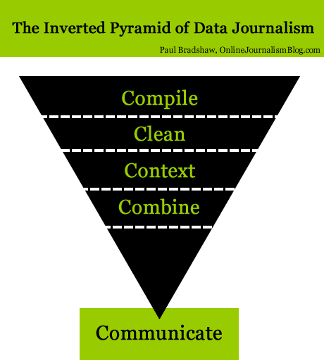
Crucially, Bradshaw writes that:
Data journalism begins in one of two ways: either you have a question that needs data, or a dataset that needs questioning. Whichever it is, the compilation of data is what defines it as an act of data journalism.
That point is crucial. There’s something about what you are doing that makes it different to just publishing the data – it’s the editorial idea behind this process, the idea that you are going to tell a story here.
I’d love to know what’s missing from this list: what would you add?


Leave a comment