Skip to content
Simon Rogers
Home
About
Archives
Contacts
Data Journalism Podcast
What We Ask Google
Speaking & interviews
Training
Animations
Facts are Sacred
On guardian.co.uk
Author:
Simon Rogers
Data journalism only matters when it’s transparent
April 24, 2014
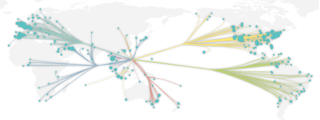
Gallery: taking #dataviz beyond infinity
April 23, 2014
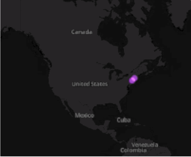
How to make an animated map with CartoDB and Torque
March 17, 2014
How to make a data journalism animation: women and equality
March 9, 2014
The kids are all bright: infographics for all ages
March 5, 2014
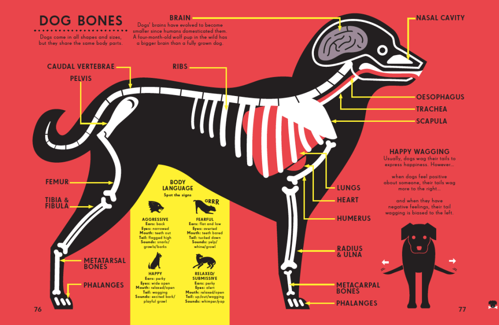
Gallery: how Peter Grundy visualises the human body
March 5, 2014
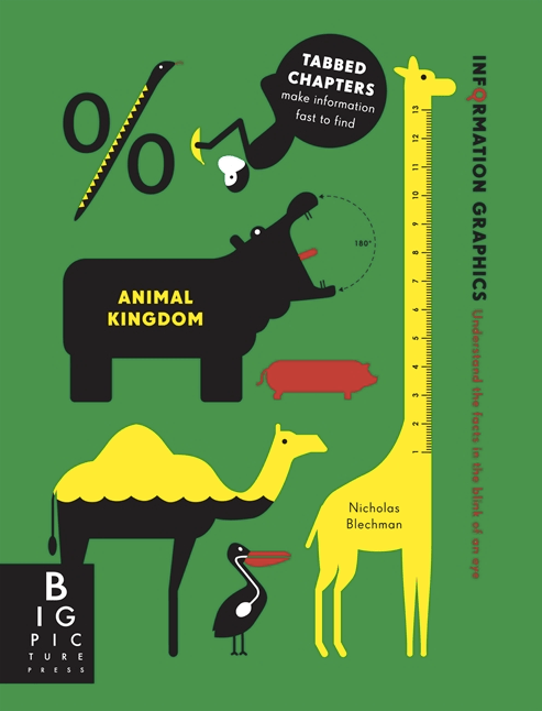
Gallery: how Nicholas Blechman visualises the animal kingdom
March 5, 2014
We need an open data Olympics. It’s not #Sochi2014
February 11, 2014
#SOTU2014: Visualizing the State of the Union
January 31, 2014
Taking maps to the edge
December 18, 2013
Previous Page
1
…
9
10
11
12
13
14
Next Page
Subscribe
Subscribed
Simon Rogers
Join 187 other subscribers
Sign me up
Already have a WordPress.com account?
Log in now.
Simon Rogers
Subscribe
Subscribed
Sign up
Log in
Report this content
View site in Reader
Manage subscriptions
Collapse this bar