First published on the Guardian Datablog
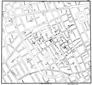
How often does a map change the world? In 1854, one produced by Doctor John Snow, altered it forever.
In the world of the 1850s, cholera was believed to be spread by miasma in the air, germs were not yet understood and the sudden and serious outbreak of cholera in London’s Soho was a mystery.
So Snow did something data journalists often do now: he mapped the cases. The map essentially represented each death as a bar, and you can see them in the smaller image above.

Dr John Snow, anaesthetist. And data journalist? Photograph: Centre for Sexual & Reproductive Health
It became apparent that the cases were clustered around the pump in Broad (now Broadwick) street. There were some outliers though: one elderly woman sent daily for water from the Broad street pump because she liked its taste. At a local brewery, the workers were allowed all the beer they could drink – but it had its own water supply and there were consequently fewer cases. It turned out that the water for the pump was polluted by sewage from a nearby cesspit. But he didn’t just produce a map; it was one part of a detailed statistical analysis.
As the Public Health Perspectives blog says, it changed how we see data visualisations, and how we see microbes. Snow was born 200 years ago this week and is the subject of an exhibiton at the London School of Hygiene and Tropical Medicine.
But how would those deaths look for a data journalist today?
Thanks to Robin Wilson at Southampton University, we have the data. Robin painstakingly georeferenced every cholera death and pump location, so we could recreate the map on a modern layout of London. We wondered what would happen if we tried to recreate the map using a modern tool, opting to try CartoDB, using the the lovely Stamen ‘toner’ projection to at least keep the background in common with Snow’s London.
An interactive version
![]()
As XKCD have pointed out, heatmaps or dotmaps have flaws, not least that they tend to show where the people are.
And the alternative is usually to aggregate the data, so that you could show, say, the incidence of cholera by geographical area – a choropleth. But in this case, would that have worked?
The cluster of dots around the Broad street pump were what alerted Snow to the cause of the outbreak.
Edward Tufte is interesting on this. He points out that
The big problem is that dot maps fail to take into account the number of people living in an area and at risk to get a disease … Snow’s dot map does not assess varying densities of population in the area around the pump
But, as Tufte points out, this part of Soho was incredibly thickly populated. And “aggregations by area can sometimes mask and even distort the true story of the data”. A choropleth map of the area might show that there was a cluster of cholera cases, but it might not, depending on where the boundaries are drawn. Mark Monmonier, author of How to lie with maps has examined this.
But there’s another key point here: in the event of an outbreak like this now, it’s inconceivable that the government would publish the data on grounds of privacy; that the victims’ addresses were personal data.
As data journalists, we agonise over how to represent the true impact of an event. Maps are often the first thing to reach for because it’s easy: the tools are now just so easy to use and so much data is geographic. Although they are often mightily popular with readers, it’s probably not always the right choice. Trying harder to show the data in different ways is an honourable objective.
But when they work, maps can tell a story in a language that everyone can understand.
Maybe Snow’s map had such a huge impact on its own because it was simply a great data visualisation.
Robin Wilson has given us links to the data below. What can you do with it?
Download the data
• DATA: download the full spreadsheet as a Google Fusion table
• Available in more formats here


We are wondering why the beautiful black iron water pump, was removed from Broad or Broadwick Street in London in 2016? Would you or anyone else know where is it situated now please? It would be sacrilege for this water pump to be gone forever from London’s history.
Posted by Pauline Bearman | September 15, 2018, 1:14 pmIs it still gone? I found this article which said it had been returned: https://londonist.com/london/latest-news/historic-pump-restored-to-soho
Posted by Simon Rogers | September 16, 2018, 6:37 pm