Twin Peaks is one of the best places to view the whole San Francisco Bay area — the two adjacent peaks visible from all over the city.
It doesn’t need a single adornment, but head up there today and you should be able to find a new addition: a sculpture. And it’s only visible with our new augmented reality app.
If Data Journalism is about anything, it’s really about telling the story in the best way possible. That has meant creating stories in newer and newer ways. But what does that look like for using data in an Augmented Reality environment?
Data journalism and visualisation is always evolving: just take its development. It wasn’t that long ago that crowdsourcing was considered a new thing. Then drone and sensor journalism became new tools for data journalists; followed swiftly by virtual reality and artificial intelligence. And I haven’t even mentioned bots yet.
But how would you begin to represent data effectively in AR? Thinking about this is what led to our latest collaboration with Accurat: Building Hopes.
Building Hope is an augmented reality data visualisation, available both as a web app and as a downloadable phone app for Android and iOS.
Here’s the links:
Is Building Hopes the way that AR could work in newsroom in future? For me, it’s really an example of how such a project could work. We wanted to see what would happen if you represented data in AR but also if there was a way to make it fun.
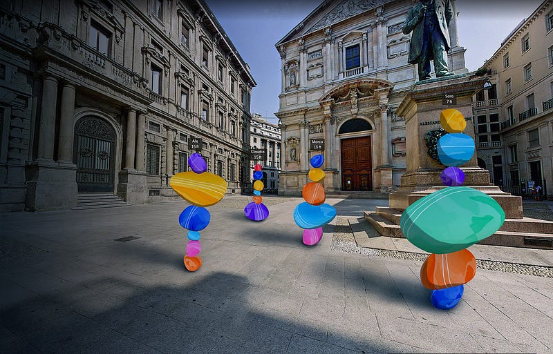
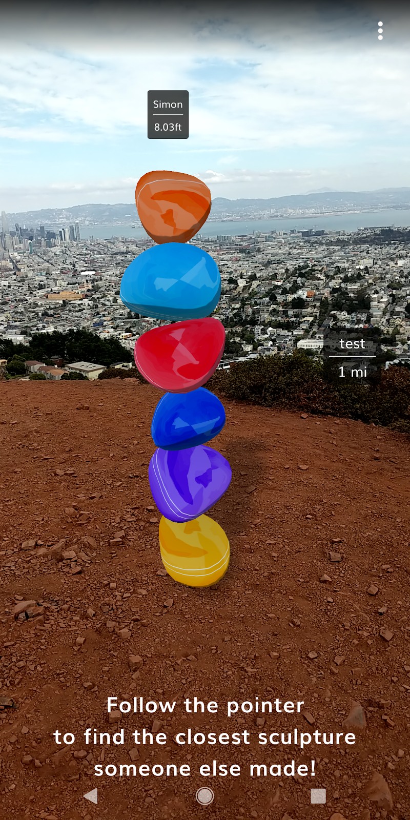
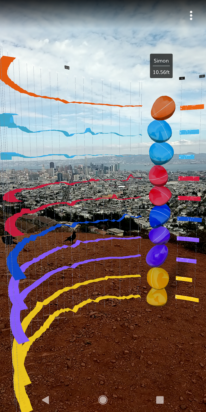
It works like this: users choose from some of the top searched subjects on Google to say what they personally feel hopeful about in the year ahead. Those choices help build a sculpture, which users can then use their phone to place wherever they like.
The sculptures are interactive — if you press on any of the individual parts, you can see how it’s searched for using Google Trends data.
The project was built for Android using ARCore, and the team used Unity to build the app for Android and iOS, which blends different libraries natively. If you’re interested in exploring building stuff in AR, there are lots of resources out there for developers looking to build AR applications with Google technology.
This is just the latest exercise in our data visualisation project, where we work closely with great designers to give them the freedom to make visuals that have to comply with just three conditions:
- They are mobile-first
- They are innovative and show data in new ways
- They are open source — so that they can be replicated by newsrooms.
The point of the project is for us to give designers space to think and to develop in ways that newsrooms don’t often get the chance to. Last month, we launched Morph, for creating generative art from data.


Leave a comment