
If you want to make an animated map (and you’re not a coder), there are not a lot of options out there. CartoDB is the best.
You can use it to make rather gorgeous choropleths but it excels at mapping large numbers of points. That makes it perfect for mapping Tweets — and I used it to make the map above. So, how does it work? This is my guide to using it.
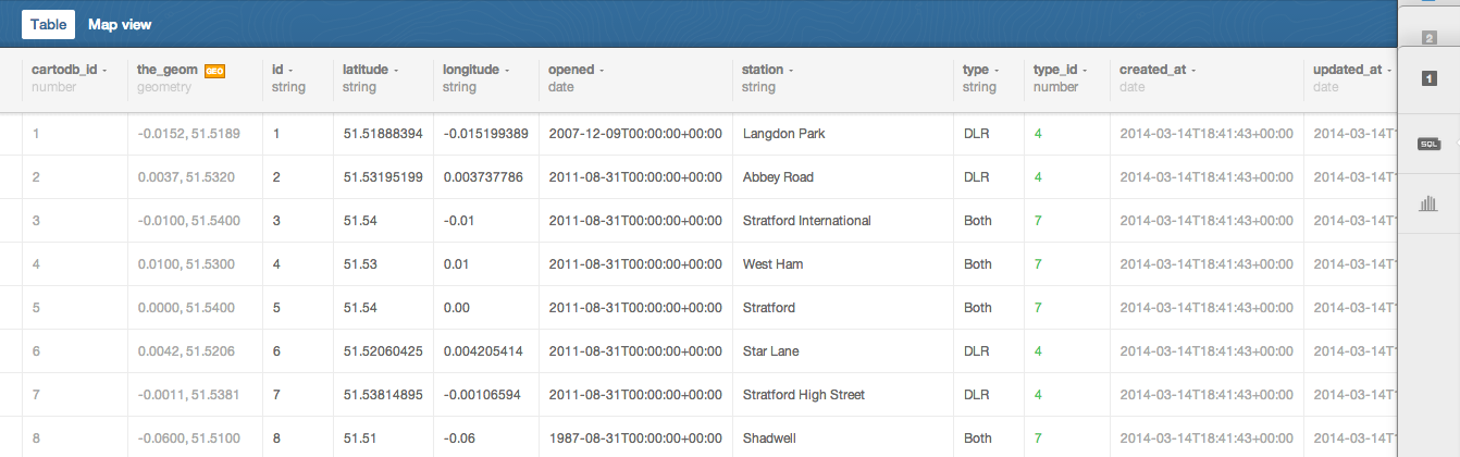
Just because it’s interesting, I’m going to use London transport data — not least because there’s nothing that combines the nerdy pursuits of transport and data better than open transport data. The data itself — a list of London’s overground and underground railway stations is munged together from a few sources, in particular:
- Openstreetmap’s list of London Underground stations with coordinates
- This list of every station plus coordinates
- Wikipedia pages detailing opening dates of both overground and underground stations
I’ve compiled the whole lot into one spreadsheet for you (you can download it here). This is what it looks like:
If you want to, you can play with the interactive itself here.
Here are the main steps to making it:
1. Format the data
The thing about CartoDB is that you can actually format the whole lot in the browser, using SQL commands. I prefer not to (not least because in 2014, I don’t really want to be using a language designed in the 1970s) and find it easier to sort out in advance. For me, that means sorting out time zones and in this case giving every station type a code number for type (ie underground was 1, overground was 2, etc). So it looks like this:

Timezones are particularly important to sort out in advance (ie you have the data in GMT but may want to show a map in PST so change the time before you upload the data) — and it there are a lot of columns you will want to delete later, it’s better to do it now.
2. Upload the data
When you’re ready, login to CartoDB and upload your new table — my experience is that CSVs work better than xlsx documents — just as is true with Google Fusion tables.
It will look something like this. If you are lucky it will have noticed the Lat and Long columns and already turned those into coordinates.
Telling Carto what type of information is in each column is really important. To do that, click on the heading and change column type — so make a number a number, a date a date and so on. If you don’t do that, nothing else will work properly.

If it hasn’t geo-referenced everything already, just click on the orange ‘geo’ button and that will start to geotag the table.
3. Create your map
![]()
Already you’re at this stage. You start by clicking ‘visualize’ in the top right hand corner. You can have a number of visualizations feeding from a single table if you want so this step is just the beginning. The table page you see will look exactly the same, the difference being that it has a title and a subtitle and is nearly a real thing.
Click map view and you see what the dots look like when they’re mapped out:

First thing to do is choose a map style — and you do that by clicking the basemap button. It also allows you to add your own custom style and I’ve added one for this map from the lovely collection by Stamen design (which you can do by hitting add yours).
This is where you choose:

So, now you have a map and a background you like. Next step is making it do stuff.
4. Animate the map
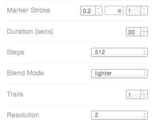
You can style the map using CSS commands if you want to but I prefer to use the wizard, which is located at the right of the screen. You get a choice of a number of static map styles but the one on the right, torque, is the one you want. When you hit that button the map will start animating right away. You have to choose the column which has the date option in too.
Use the button below to select colours of your dots:

Then you have some other options. I wanted the dots to add up rather than switch off and on, so I set cumulative on.

You can also select how long you want the animation to last by changing duration. Marker stroke is the little border around the outside of the dot — I often just switch that to zero. Trails will make the dots flash off and on the screen in a longer way, which can work well.
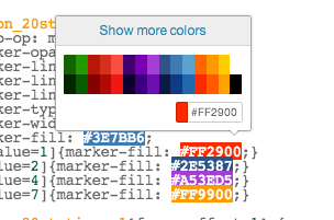
The other key thing for this map is that I wanted different coloured dots. This meant that I had to edit the CSS file (there’s a CSS button on the right) which I changed to look like this:

You can see how the name of the column (‘type_id’) is in the code, so it knows which number to use. And there’s a neat new feature that if you click on the colour hexcode you can actually pick another colour, like this:
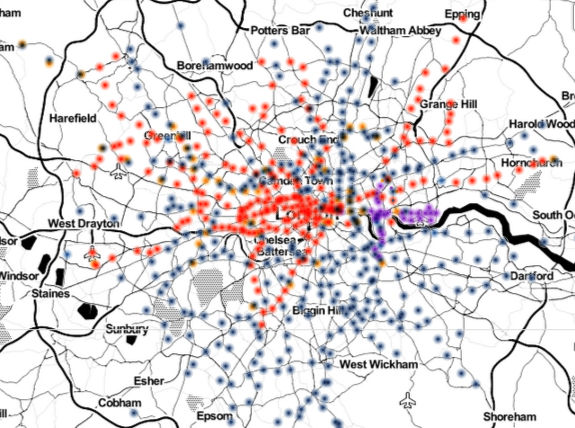
When you hit apply style you should be able to see the changes immediately. Then the map starts to look like this:
And that’s it! CartoDB has a whole set of tutorials right here for you to use to help train you up — and I would love to see the cool maps you make.


Leave a comment