It’s a crisis unparalleled in modern times: the biggest outbreak of Ebola ever recorded. So, what do we know about it?
Data journalism is about taking the key data, breaking it down and making it accessible. So a major story like this is where getting the data can help us understand it better. So what data is actually out there, where do you find it and what does it tell you?
I couldn’t find it anywhere else, so I’ve collected the raw data into this spreadsheet — please feel free to download it.
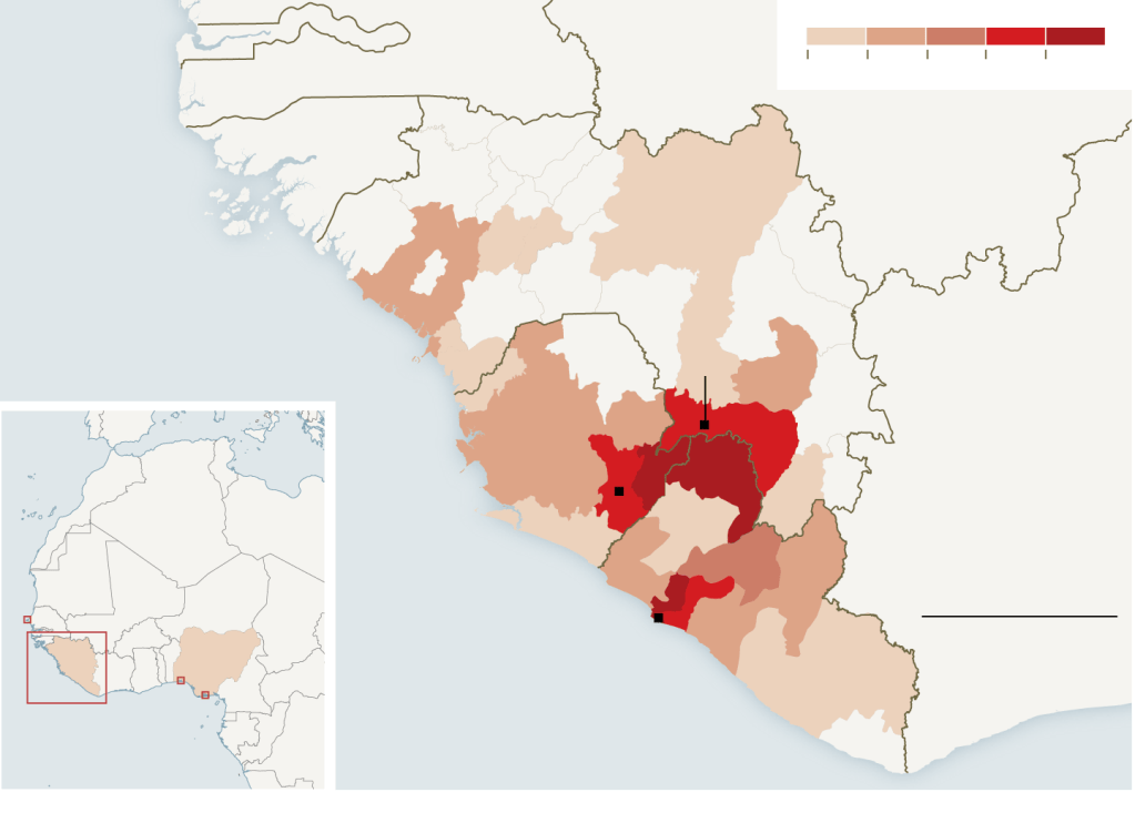
1. Liberia has suffered worst

By any measure, Liberia has been hit hardest, with 2,700 people dead. That is a big number, but it’s also important to see how big a proportion of the population have contracted Ebola. Click on the chart above and you can see cases per 100,000 population, which is the best way to compare different countries with different numbers of people living in them.
This data is from the World Health Organisation’s regular report into the outbreak. This data comes as a PDF, but the data is small enough to easily extract to pull into a chart.

There’s a lot of data contained in the WHO report, which is aimed at healthcare workers. They are in danger too: so far there have been 318 cases and 151 deaths among people helping to fight the virus. There have also been at least 13 imported cases, where foreign citizens have contracted the disease and been transferred back to Europe or the US.
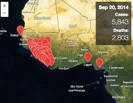
The geo data has been mapped by both the New York Times and Vox — athough both use absolute raw numbers for their choropleth maps, as opposed to proportions or ratios.
If you’re a map purist, this may actually be less clear than this one, published by the WHO as part of its report, which shows the outbreak as circles, although they can be hard to distinguish between. Mapping is complicated and all the hard and fast rules have been broken by most people who make them.

Say you wanted to recreate this map, how would you do it? Sierra Leone and Liberia’s health ministries regularly publish local level data by different areas:
Guinea’s government website is not working.
Liberia also has a simple but elegant open data platform for getting the data which is regularly updated and includes easily-embeddable charts. There are some great simple resources out there too, including this one from Frontline which tells the story of the outbreak from patient zero onwards.
2. This is the worst outbreak ever
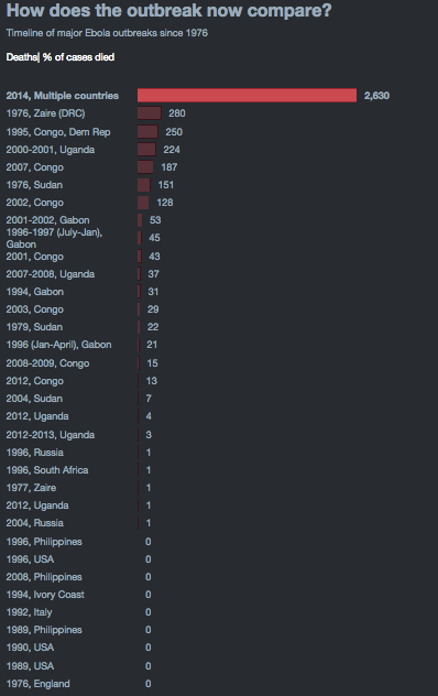
This data from the US CDC shows how this outbreak compares. In raw numbers, it is unquestionably the biggest recorded outbreak. This data has also prompted a number of great interactive guides, including this one from ESRI and Reuters too.

The Telegraph has also done a nice job of mapping this historical data too:

3. The USA is giving more than any other country to fight Ebola…

This data, from the UN’s financial tracking service, shows total funding by country to the emergency appeal — that is firm commitments plus actual transferred cash. The US is traditionally high up in funding international crisis, behind big organisations like the World Bank. However, you can look at it another way…
4. …although is Kuwait actually more generous?

If you look at dollars spent per head of the population, the US is no longer top, with other smaller countries that have become big donors climbing above the world’s richest nation. So for every one of its residents, Kuwait is donating nearly $2 to the fight.
5. Ebola is not the best-funded appeal this year

The world in 2014 is a dangerous violent place, with crisis after crisis hitting the headlines. The chart above (data from the UN) shows 2014 emergency funding by appeal, with Syria’s refugee crisis leading to $2bn of funding in 2014, and Iraq the Philippines and other countries competing for assistance.
6. Where can we get this data?
I’ve extracted the data and stuck it in a spreadsheet. If you do something with it, I would love to see it — please contact me and let me know.


Leave a comment