Skip to content
Simon Rogers
Home
About
Archives
Contacts
Data Journalism Podcast
What We Ask Google
Speaking & interviews
Training
Animations
Facts are Sacred
On guardian.co.uk
Tag:
dataviz
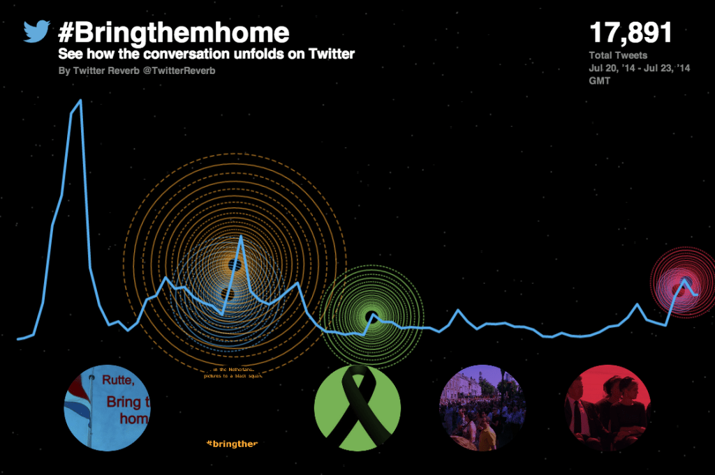
Twitter Reverb: how we made a new #dataviz tool
August 14, 2014
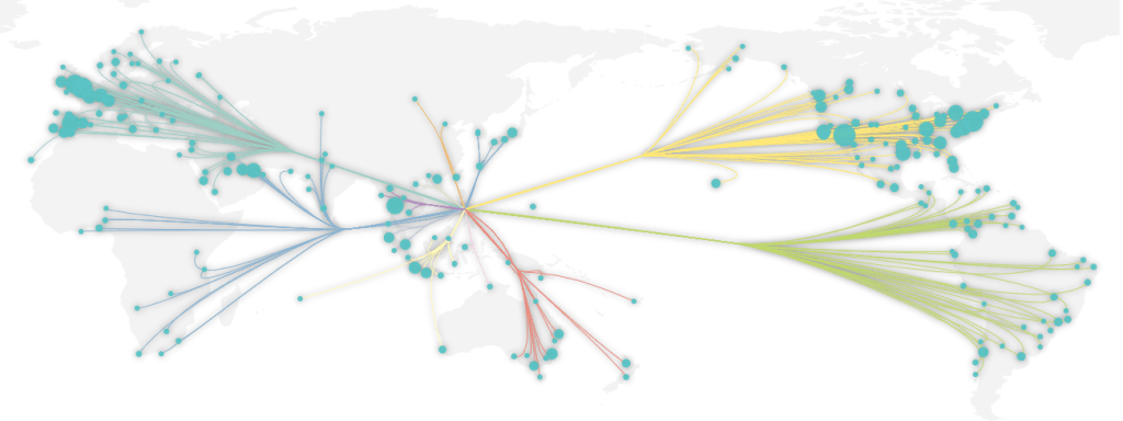
Gallery: taking #dataviz beyond infinity
April 23, 2014
#SOTU2014: Visualizing the State of the Union
January 31, 2014
Taking maps to the edge
December 18, 2013
Goodbye #NelsonMandela: visualising the response
December 6, 2013
What is data visualisation (for a non-technical audience)?
July 3, 2013
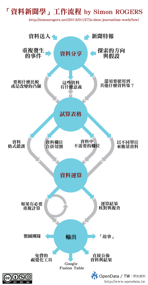
Chart: A data journalism workflow – translated into different languages
May 20, 2013
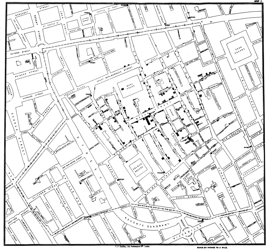
John Snow, data journalist
March 15, 2013
A conversation with Stephen Few about data visualisation. Kind of
March 15, 2013
Gallery: new images from Facts are Sacred
January 28, 2013
Previous Page
1
…
3
4
5
6
Next Page
Subscribe
Subscribed
Simon Rogers
Join 187 other subscribers
Sign me up
Already have a WordPress.com account?
Log in now.
Simon Rogers
Subscribe
Subscribed
Sign up
Log in
Report this content
View site in Reader
Manage subscriptions
Collapse this bar