- New event: Join me live in San Francisco, May 6
- Data + Birds = Beauty
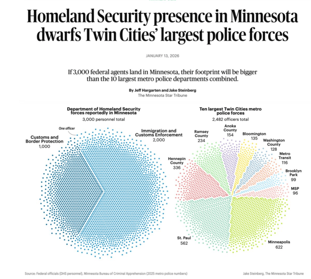
- New podcast alert: Data journalism in the face of ICE and subzero temperatures in MN
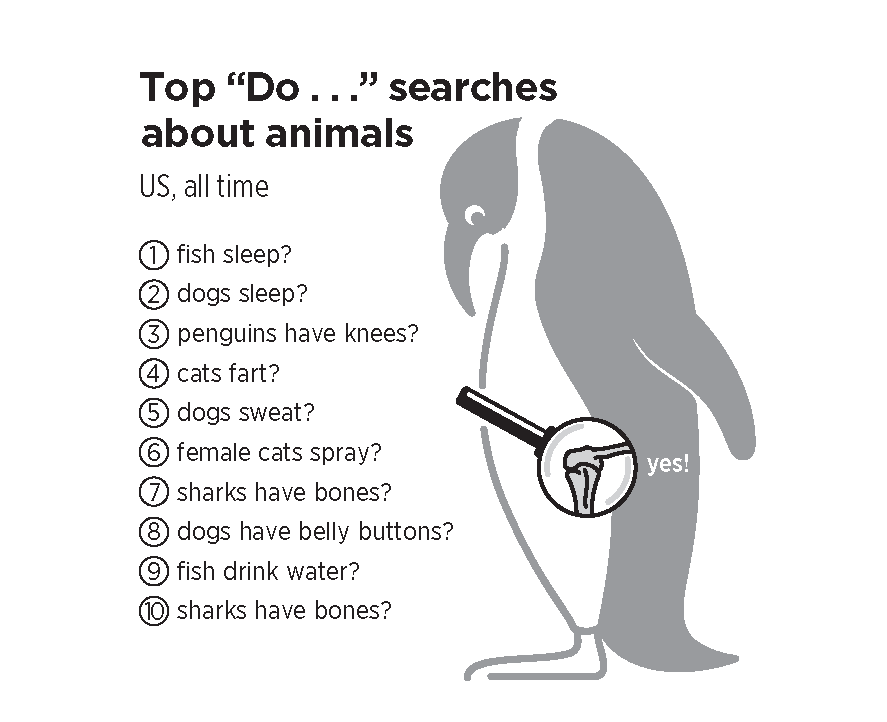
- New pages from ‘What We Ask Google’
- New podcast episode: Data storytelling in 2026
- Breaking New Ground with the Straits Times
- New podcast episode: Charts as Political Theater
- How data storytelling has changed
- Richard Scarry taught me everything I know about visual storytelling
- What is happening with datavisualization today?
- New pod episode: Finding Ourselves in Historic Data
- Datapocalypse! Are we losing our public data?
- Data+Love+why it matters in the age of AI
- Chiqui Esteban: Insights from the Washington Post Graphics Team
- Scott Klein: tales of 2024
- David Spiegelhalter: The Art of Uncertainty
- My New Book on Google Search Trends
- Kae Petrin: data for change
- Garrett Archer: on the election data frontline in Arizona
- AI and data journalism: the AP’s Garance Burke
- How the Pulitzer Center does data journalism
- The Cool Grey City of Data: inside the San Francisco Chronicle’s data team
- Sonified: how we made a data album
- Data journalism for CNN
- Holiday special: why data storytelling matters
- “Hungary is a data journalism superpower”
- Data journalism at The Guardian
- Alan Smith: Inside the FT’s data journalism operation
- New podcast episode: Data journalism in Kenya, with Eunice Magwambo
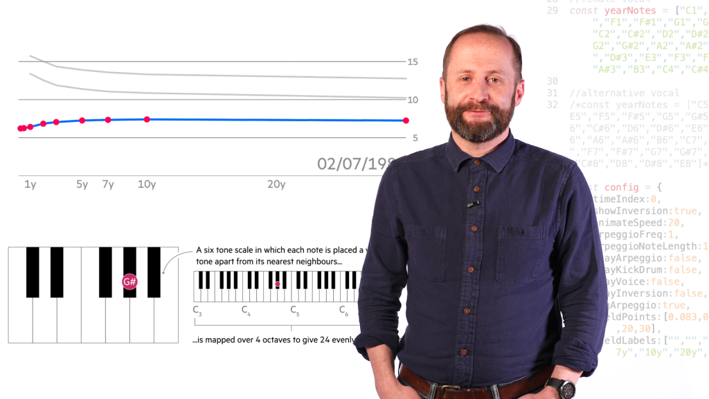
- AI for data storytelling
- Rani Molla: data for journalism
- Florence Nightingale and the history of dataviz
- The science of dataviz, with Jen Christiansen
- CNN’s Harry Enten: Data for TV
- Nigel Holmes: the joy of data
- Nathan Yau: the flow of dataviz
- Amanda Cox: bringing facts to the people
- How Axios brings smart brevity to data journalism
- New episode: Inside the New York Times Graphics Team
- Searching for The Beatles
- Information is Beautiful: an interview with David McCandless
- Data stories for the US Midterm elections
- A Data Journalist in Ukraine
- Data journalism for the people! Ben Welsh and MaryJo Webster on the state of local data journalism
- 2021 in data journalism: Scott Klein on how ProPublica does it, plus our favourite projects of the year
- Inside The Pudding
- Doing data journalism in Afghanistan, Myanmar and across the Global South
- The Census data was published. What does it mean for data journalists?
- US Census bonus podcast episode
- COVID data journalism special podcast episode
- Taking the numb out of numbers
- How to make data journalism for humans
- Introducing The Data Journalism Podcast
- New visual: A pandemic year of Trends
- How do you track GDP in realtime?
- Visualised: how we are searching for Election 2020
- Mapping live George Floyd protest videos
- How local journalists can map COVID-19 cases
- A new free online course in Data Journalism
- A decade of working in data journalism: what has changed?
- Sonification: make beautiful music with your data
- How to build a dataviz in Augmented Reality
- The weight of words (and data)
- Want to build a VR network chart? Here’s a way to do it without coding
- Can data journalism be taught?
- Visual journalism gallery: images from the world’s best newsrooms and designers
- A new machine learning app for reporting on hate in America
- Data needs empathy to make it real
- Open data is a right
- Gallery: visualising technology and our changing world
- Documenting Hate: gathering data where there is none
- US election 2016: How to download county-level results data
- Electionland: the most important data journalism project this year
- How is the world searching for the US Presidential Election? A Data Visualisation from the Google News Lab.
- Tilegrams: Make your own cartogram hexmaps with our new tool
- Election DataBot: harnessing the power of the matrix
- Building an Alternative Olympic Medal Table
- How we made a VR data visualization
- Data Journalism Awards 2016: what the winners tell us about the state of the data nation
- Podcast: It’s never been a better time to be a data journalist
- Data journalism matters more now than ever before
- Three refugee datasets for the 19 Million Project
- We need a Data Journalism Archive. Before it becomes just another 404 error
- How to make a multi-screen interactive
- Data journalism in China
- A data journalist at Twitter
- Gallery: Space, the universe and everything visualized
- The five Ws of data journalism
- Journalist datastores: where can you find them? A list.
- Ebola in charts: data journalism and the outbreak
- If devolution killed national data, what would Scottish independence do?
- What data journalism told us about #Ferguson
- Twitter Reverb: how we made a new #dataviz tool
- Saving the oceans: with data
- Data journalism needs to go mobile
- Introduction to data journalism
- Data journalism: learn how to do it for free
- Data journalism only matters when it’s transparent
- Gallery: taking #dataviz beyond infinity
- How to make an animated map with CartoDB and Torque
- How to make a data journalism animation: women and equality
- The kids are all bright: infographics for all ages
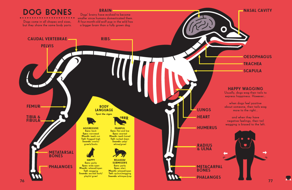
- Gallery: how Peter Grundy visualises the human body
- Gallery: how Nicholas Blechman visualises the animal kingdom
- We need an open data Olympics. It’s not #Sochi2014
- #SOTU2014: Visualizing the State of the Union
- Taking maps to the edge
- Goodbye #NelsonMandela: visualising the response
- What is data visualisation (for a non-technical audience)?
- Visualised: the world’s biggest banks and the debts we owe them
- Remembered: the soldiers who fought for a foreign empire
- Chart: A data journalism workflow – translated into different languages
- The new White House open data executive order: how does it compare to the British version?
- My life as a data visualisation
- Gallery: images from a newspaper
- Farewell Guardian, hello Twitter
- Data journalism: a video guide to its practice and history
- John Snow, data journalist
- A conversation with Stephen Few about data visualisation. Kind of
- CartoDB v Google Fusion: how to map every meteorite
- Video: what happens when you get a bunch of data journalists together to discuss journalism
- Mapping the census: how we did it (in three steps)
- Data journalism and James Cameron: a world of questions
- Is the ONS really open data?
- Gallery: new images from Facts are Sacred
- Borders and boundaries: 16 Google Fusion border files for you to use
- How to make a map with Google Fusion tables
- Data journalism: 22 key links
- A data journalism workflow
- Mapping a disaster
- How to put girls off from all forms of programming/tech by Emma der Mulqueeny
- Anyone can do it. Data journalism is the new punk
- Open data journalism
Archives

Published May 5, 2026: Ever wondered what goes through other people’s minds—their silly questions, their inner anxieties, hopes, and dreams?